To avoid the last-minute rush of selecting a unique wedding color combination, it’s essential to finalize your choices early on. A cohesive color palette can tie together various aspects of your special day, including attire, flowers, cake, and venue décor. The harmony of your colors sets the tone for the entire event, ensuring a seamless experience for you and your guests.
By choosing a color combination early, you’ll have ample time to create a distinctive and trendy palette that blends dark, light, and rainbow hues. This allows you to experiment with different tones and combinations, resulting in a one-of-a-kind visual representation of your wedding. In this post, we’ll explore various wedding color ideas to help you find the perfect fit for your big day.
Brides Often Ask
What is the most popular wedding color?
The world of wedding colors is a vast and vibrant one, with popular hues ranging from calming blues and greens to bold pinks and oranges. Creamy tones and rich darks like red and aqua also make the cut. And then there’s gold – a timeless favorite that never goes out of style. When paired together in stunning combinations, each color creates a unique mood and makes a statement. As we delve deeper into this world, you’ll see just how these colors come alive when combined.
Popular color combinations
Giving color schemes a fresh look can be as simple as pairing unexpected hues together. Certain combinations have proven more appealing than others. The harmonious blend of taupe, black, and red, the soft allure of peach and mint with gold, the dramatic flair of jewel tones, and the sophisticated simplicity of monochrome are just a few examples of popular pairings that can add brightness, romance, power, or depth to your design.
Which color combinations go well together?
When it comes to color combinations, harmonious pairings can be achieved through various approaches. One way is by selecting analogous colors, which fall along the same gradient on the color wheel. For instance, blue-green, yellow-orange, and blue-violet form a natural progression. Another approach is to choose complementary colors, which are opposite each other on the color wheel, creating pleasing contrasts like red-green and blue-orange.
Finally, triad combinations can strike a balance between harmony and visual interest by combining well-spaced yet evenly balanced hues such as yellow-green and blue-violet.
How to choose wedding colors?
Starting from scratch, begin by conceptualizing your ideal wedding atmosphere. Envision your ceremony and reception layouts, taking note of the colors, textures, and overall aesthetic you desire. From this foundation, select a primary color palette that resonates with your personal style. Then, thoughtfully incorporate complementary hues and accent shades to bring depth and dimension to your design.
As you refine your visual representation, you’ll discover harmonious wedding color combinations that reflect your unique vision. Meanwhile, knowing that timing is everything, we’re here to guide you in planning your special day, empowering you to manage stress and focus on the joy of celebrating with loved ones.
Unique Wedding Color Combos
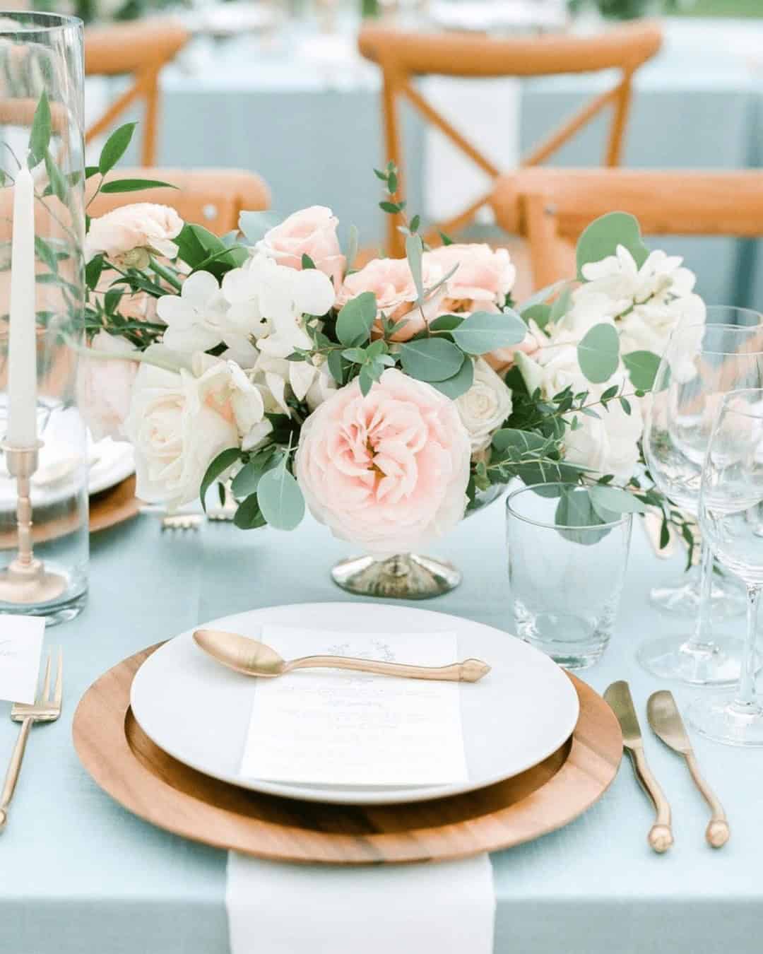
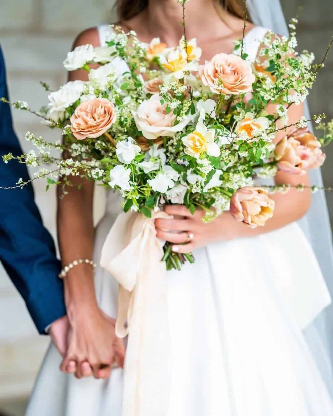
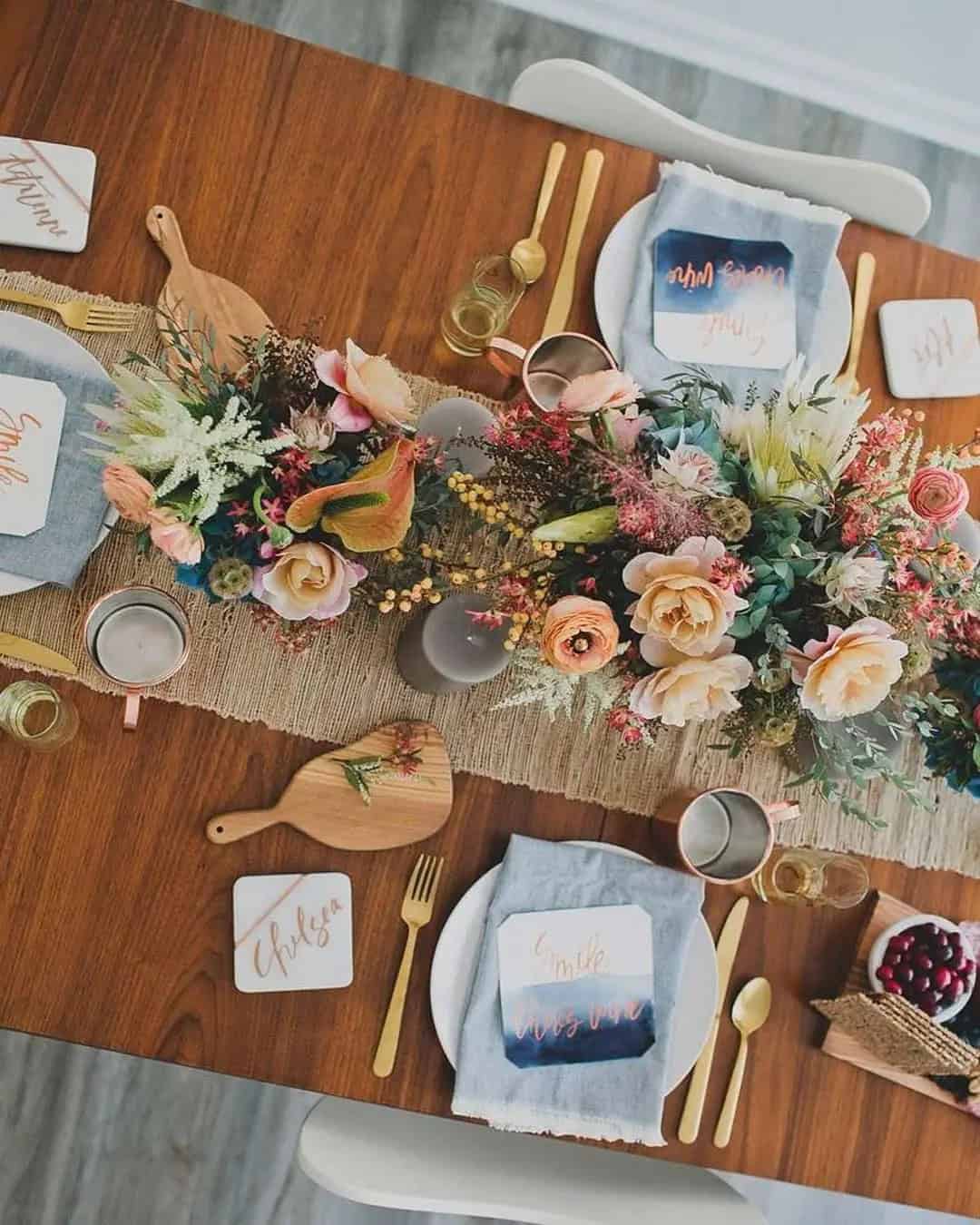
Mint + gold + peach
Gold is an iconic color that can elevate any spring wedding. When paired with mint and peach, it creates a stunning combination that’s perfect for whimsical themes with minimalist style. The cool tone of mint complements the warm tone of peach beautifully, making them a harmonious pair. To incorporate this unique color palette into your wedding design, start by using mint as the base color for elements like bridesmaid dresses, tablecloths, and napkins.
Then, add pops of peach through your cake, bouquet, and dinnerware. Don’t forget to include gold accents throughout to tie everything together. For added ambiance, surround centerpieces with tall candles and incorporate floral arrangements featuring mint, peach, and greenery.
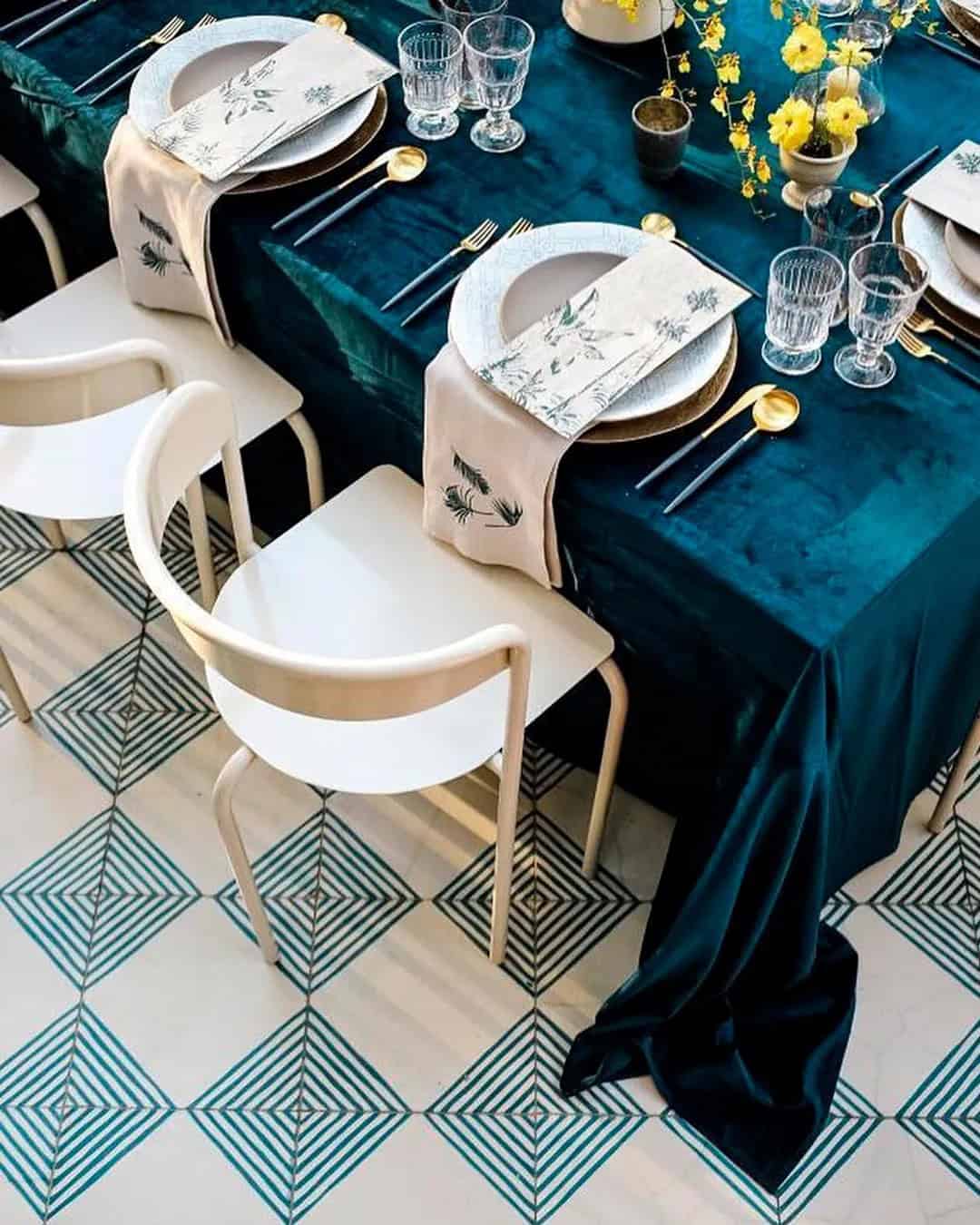
Emerald + jade + charcoal
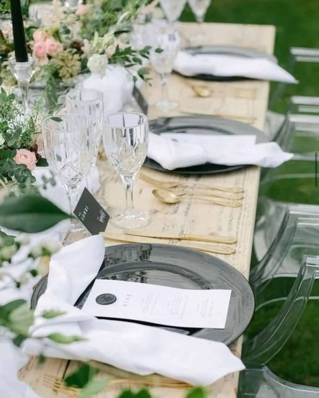
Emerald and jade green hues can be both overpowering and underwhelming if not balanced properly. The addition of charcoal provides a harmonious equilibrium, allowing these colours to truly stand out. This unique colour combination is particularly well-suited for nature-inspired, outdoor summer weddings with a rustic flair.
For styling purposes, consider pairing jade or emerald green shades with charcoal accents to create a cohesive look.
Men’s attire could feature charcoal suits accompanied by jade ties and green boutonnieres. Meanwhile, bridesmaid dresses, tablecloths, napkins, and vases for centerpieces can be adorned with emerald tones.
To further incorporate these colours into your wedding decor, use jade candles and plates alongside silver cutlery for your table settings. Create stunning floral arrangements, bouquets, and centerpiece blooms by combining all three colours.
Finally, elevate your dessert tables with a mix of jade, charcoal, and emerald elements. Complete the look with wedding invitations and place cards featuring jade backgrounds with charcoal lettering.
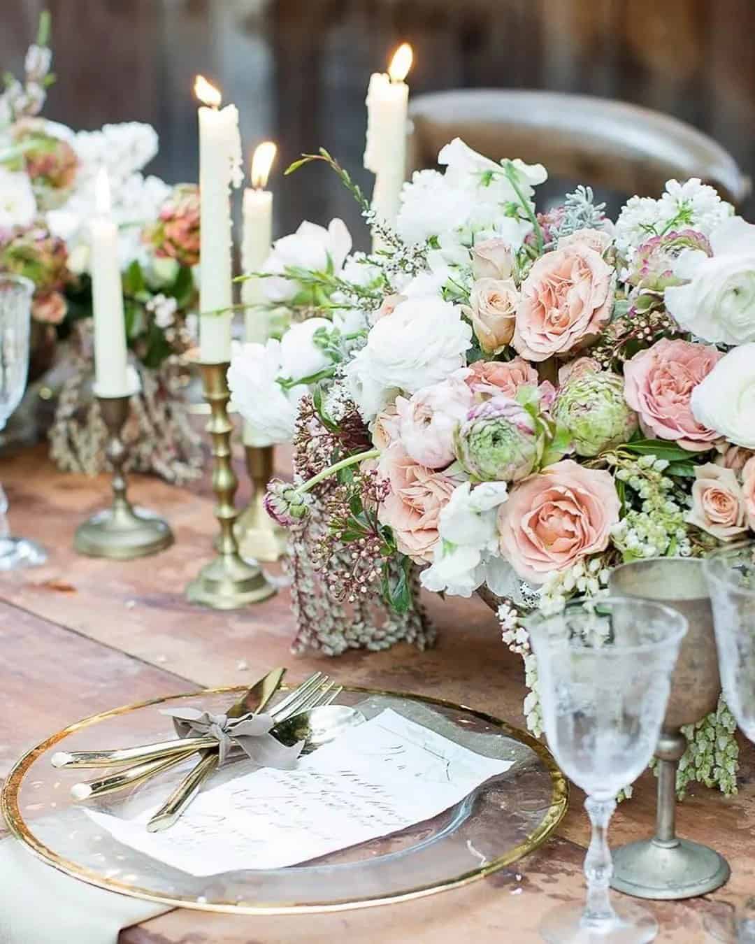
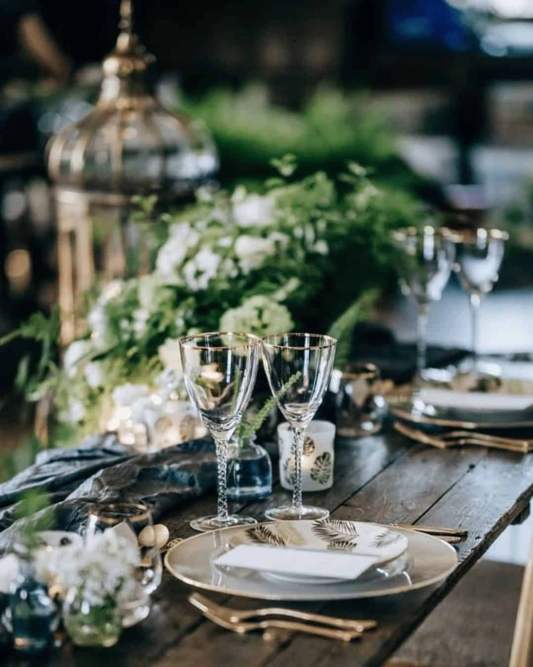
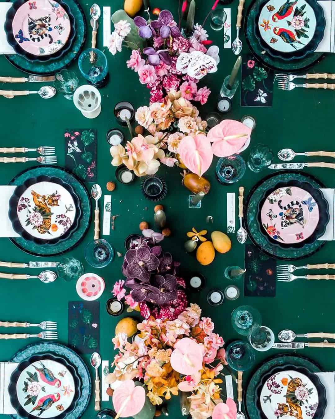
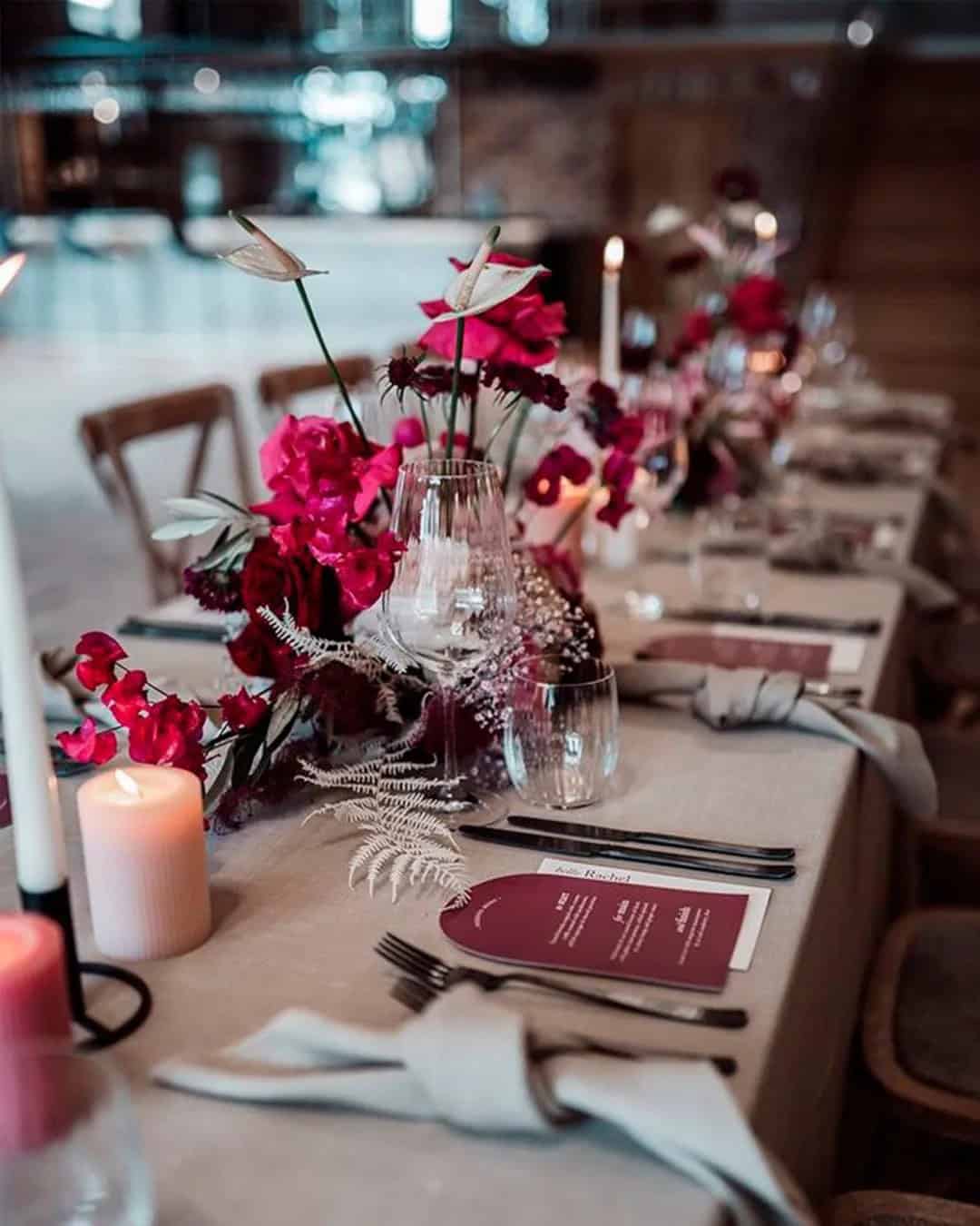
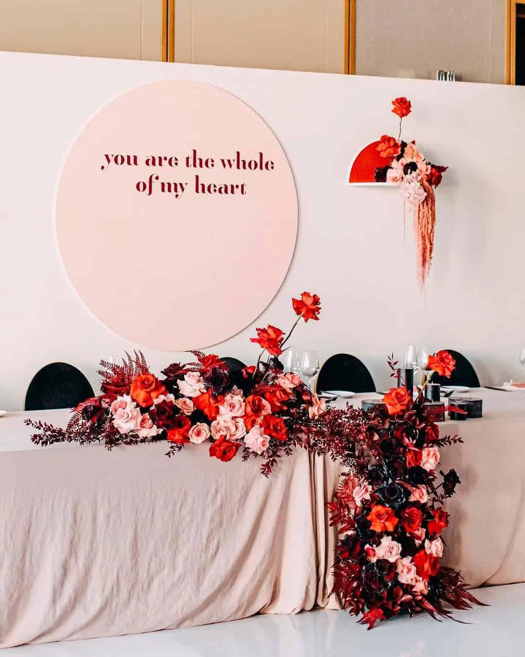
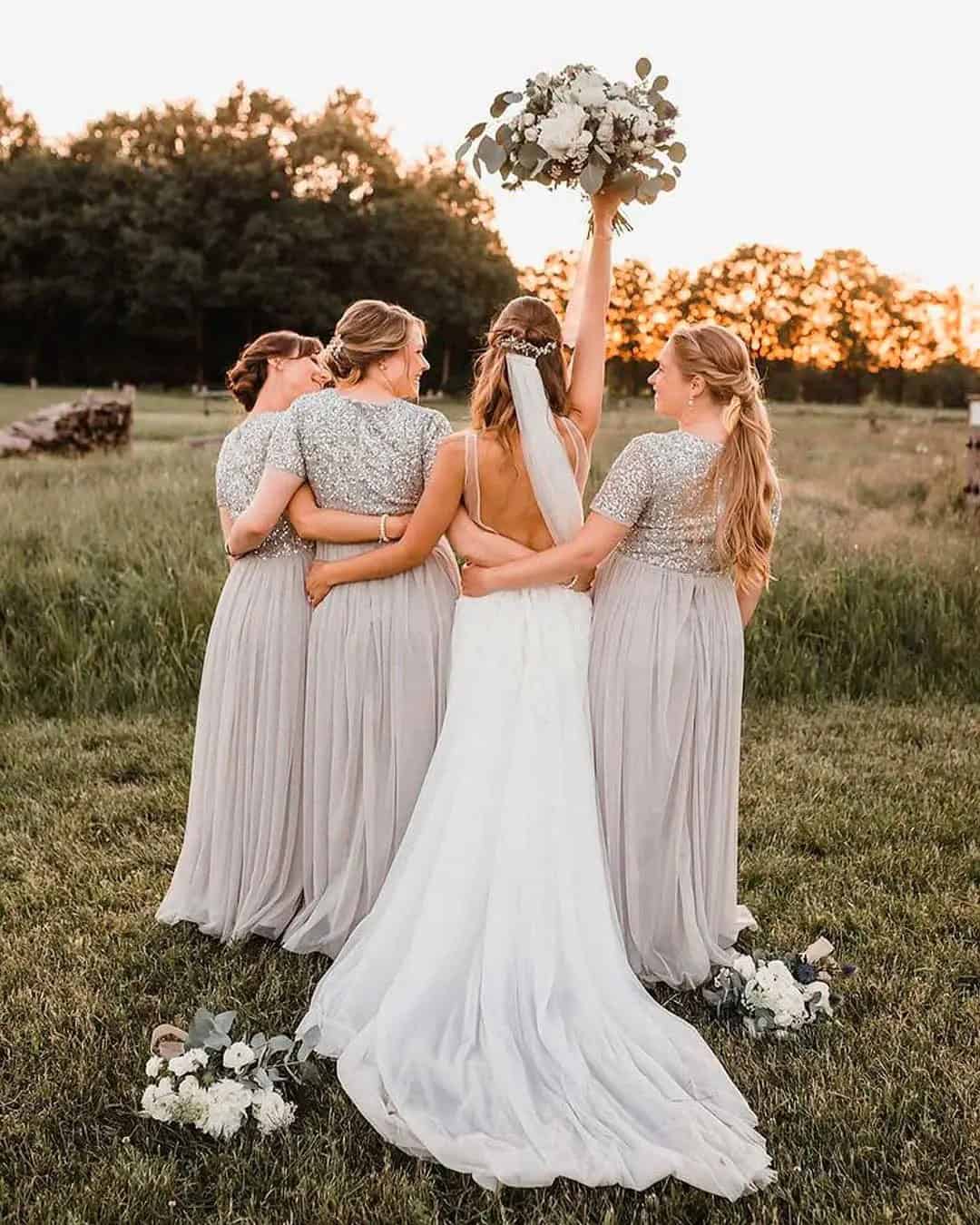
Red + black + taupe
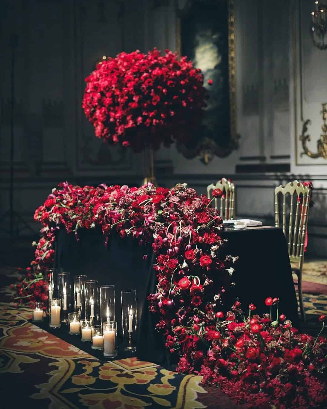
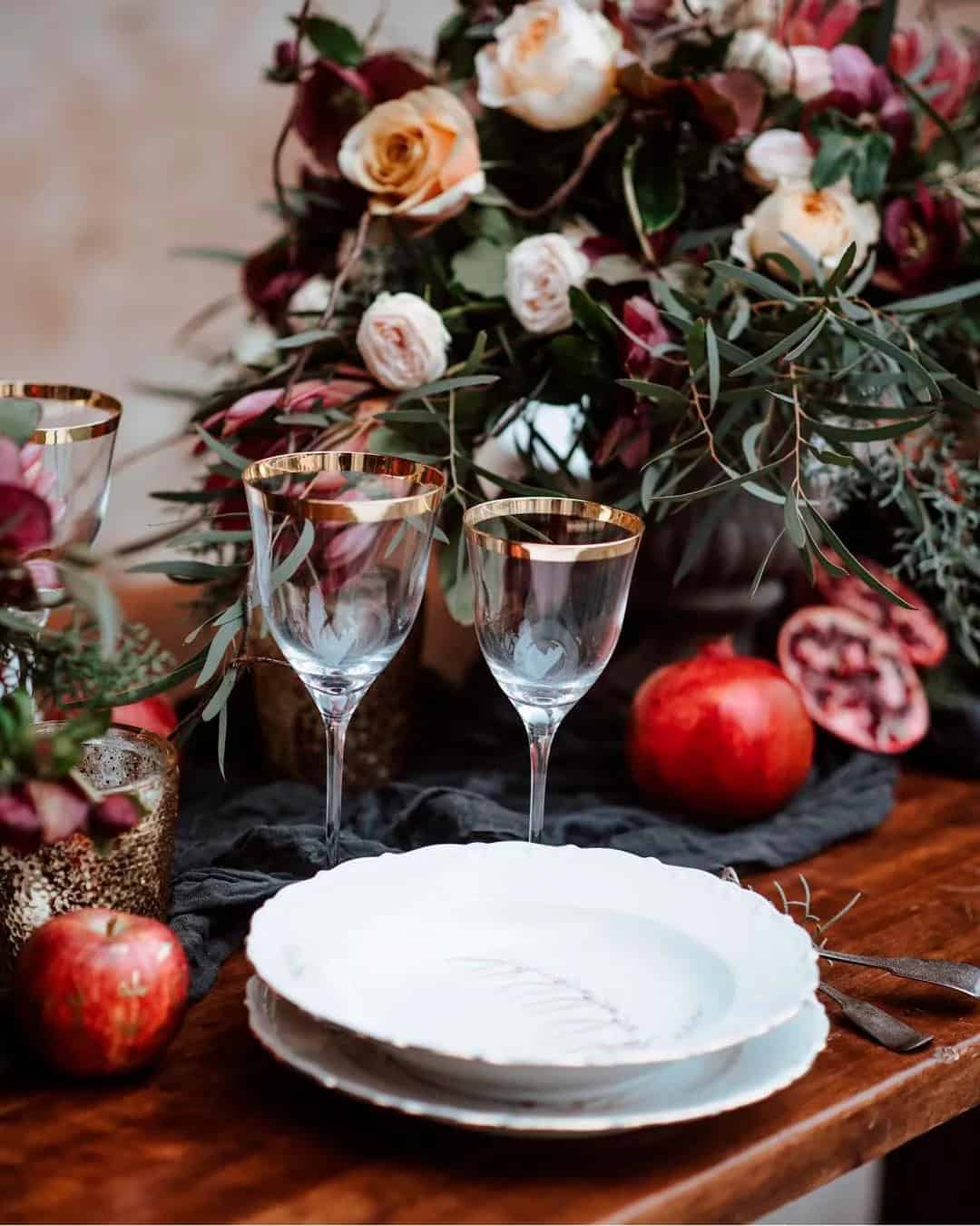
When it comes to winter wedding colors, red and black are popular choices that can sometimes feel overwhelming on their own. That’s where taupe comes in – a neutral tone that adds a touch of calmness and cuteness to the overall aesthetic. This combination is perfect for grand ballrooms and evokes a sense of formality. The contrasting hues of red and black, representing romance and power respectively, are balanced by the soothing quality of taupe.
For a cohesive look, consider pairing black dresses with red accents for bridesmaids, while the maid of honor wears a bold red dress. Add to this a bouquet featuring red, white, and taupe flowers, along with hot red stilettos. For the gentlemen, a black suit paired with a red tie or boutonnière creates a sharp look. Complete the table settings with black and white linens, deep red dinnerware, and taupe napkins for a visually appealing and memorable winter wedding.
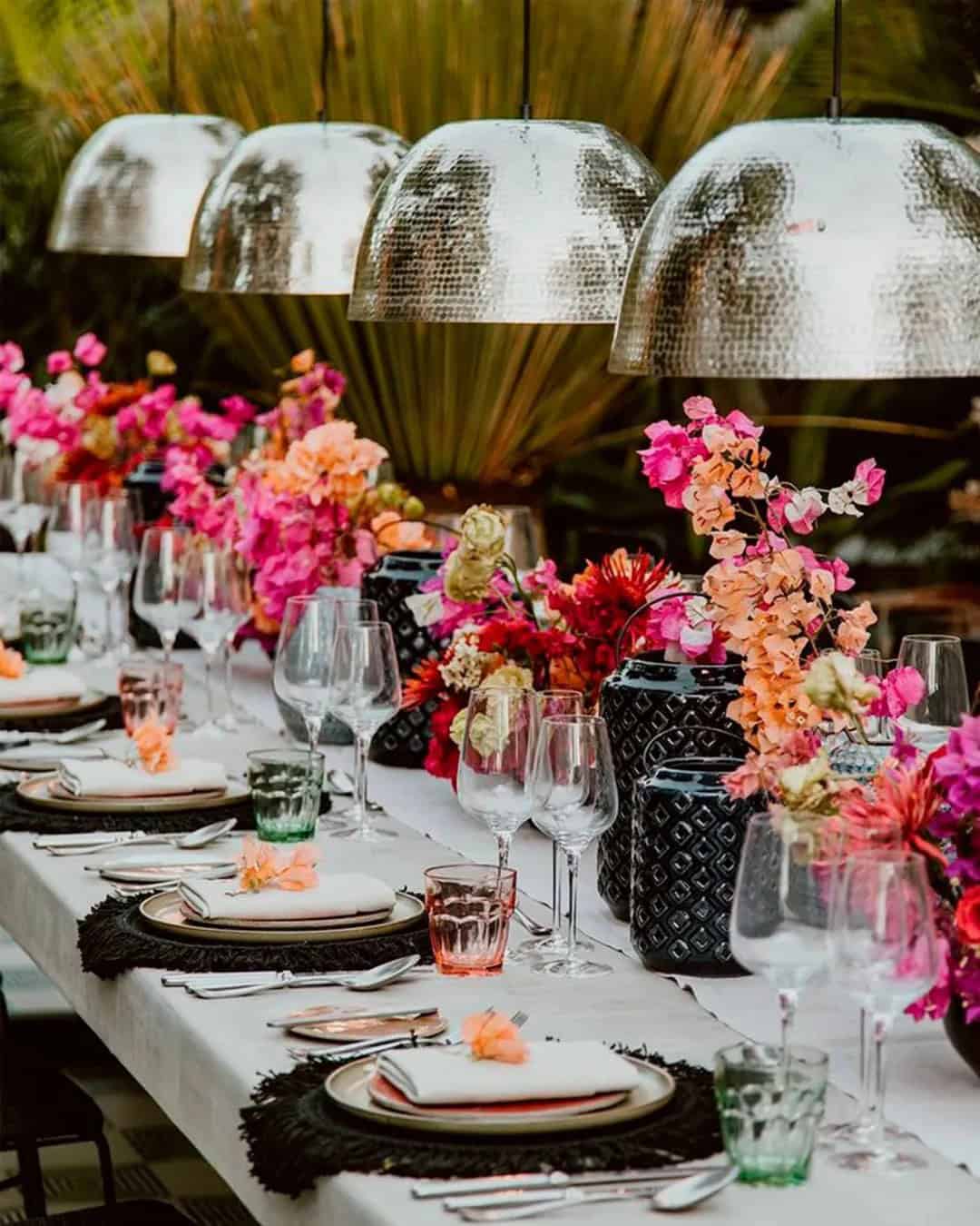
Peacock Blue + Papaya + Sand
Incorporating papaya, sand, and peacock blue into your wedding color palette creates a stunning combination that evokes the serenity of a beachfront sunset. This harmonious blend can be easily replicated in various aspects of your special day. For a summer or fall beachfront wedding with modern undertones, this trio of earthy tones is sure to impress. Start by incorporating sand-colored or wooden chairs and adorn them with peacock blue and papaya flowers.
The tablescape can feature peacock blue tablecloths, paired with sand tone flatware and papaya napkins for a cohesive look. Consider dressing your bridesmaids in stunning peacock blue dresses, and have them carry bouquets comprised of sand and papaya hues. To add a touch of whimsy, roll up the bouquet stems with coordinating peacock blue ribbons. For a show-stopping dessert, decorate the sand iced cake with pops of papaya and peacock blue.
Finally, complete your look with a pair of stylish papaya or sand tone pumps that tie in perfectly with your chosen color scheme.
Gradient Monochrome
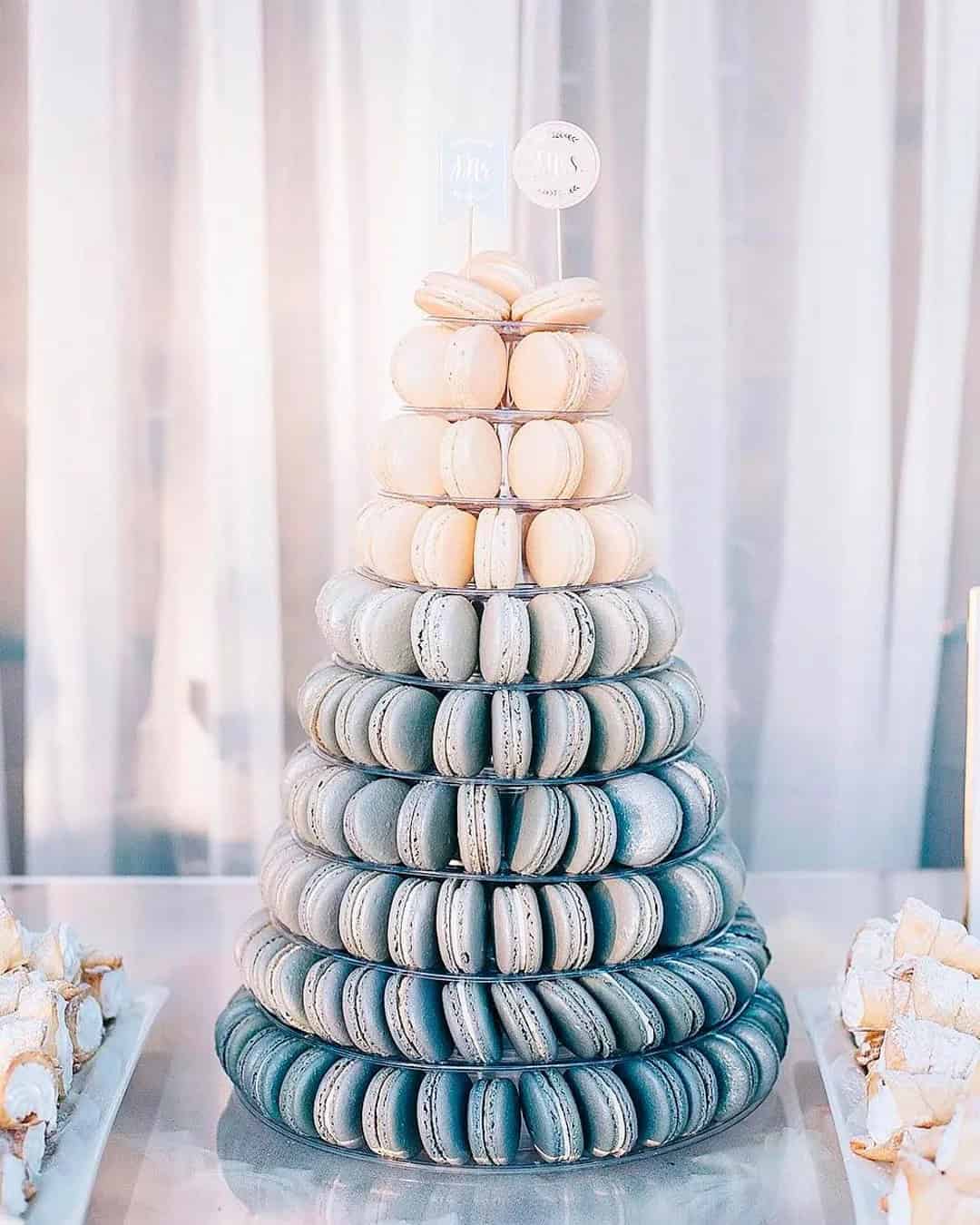
As you gaze upon the captivating ombre-inspired wedding palette, you’re probably wondering how to seamlessly integrate this trend into your special day. To help you achieve a whimsical and wanderlust-inspired atmosphere, we’ve curated three unique gradient monochrome color schemes that effortlessly blend one hue across varying shades. Perfect for field and lakeside weddings with a woodsy theme, these ombre progressions will transport your guests to an enchanting realm.
By playing with different shades of the same color, you can create a cohesive look that flows effortlessly from decor to attire. To bring this trend to life, simply incorporate your chosen ombre progression into various aspects of your wedding, including table decor and napkins, cakes, flower vases for centerpieces, floral arrangements, and bouquets. Add some greenery to give your designs an extra pop of color.
Don’t forget to extend the gradient monochrome aesthetic to your snacks, salads, parfait, and stationery. Finally, add a touch of magic with white lights that will leave your guests mesmerized.
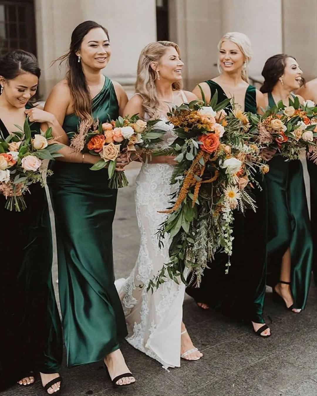
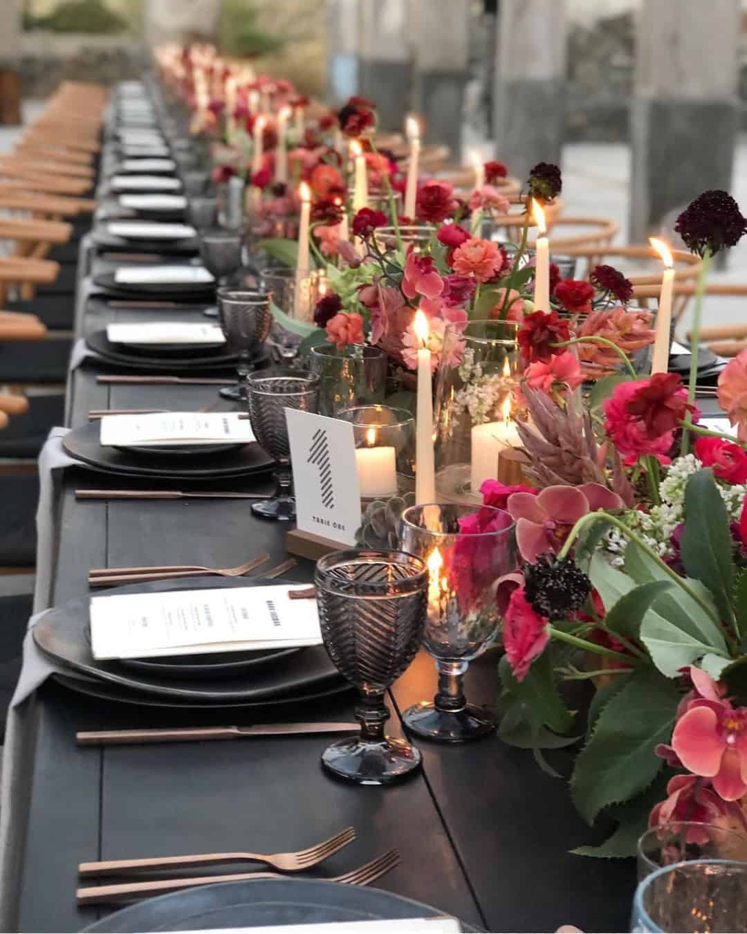
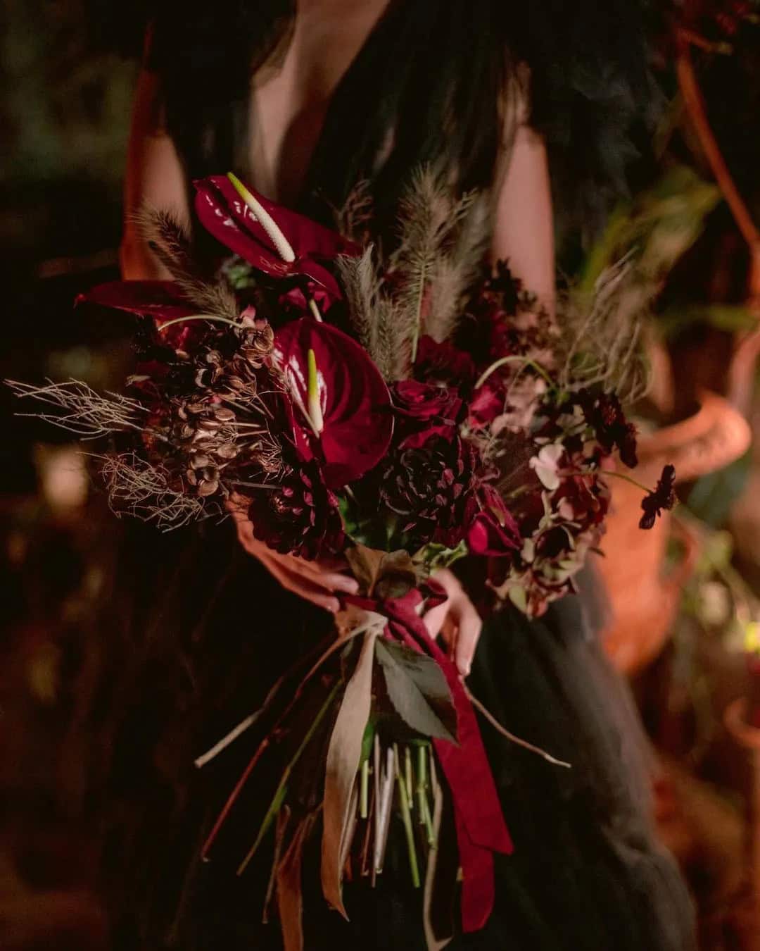
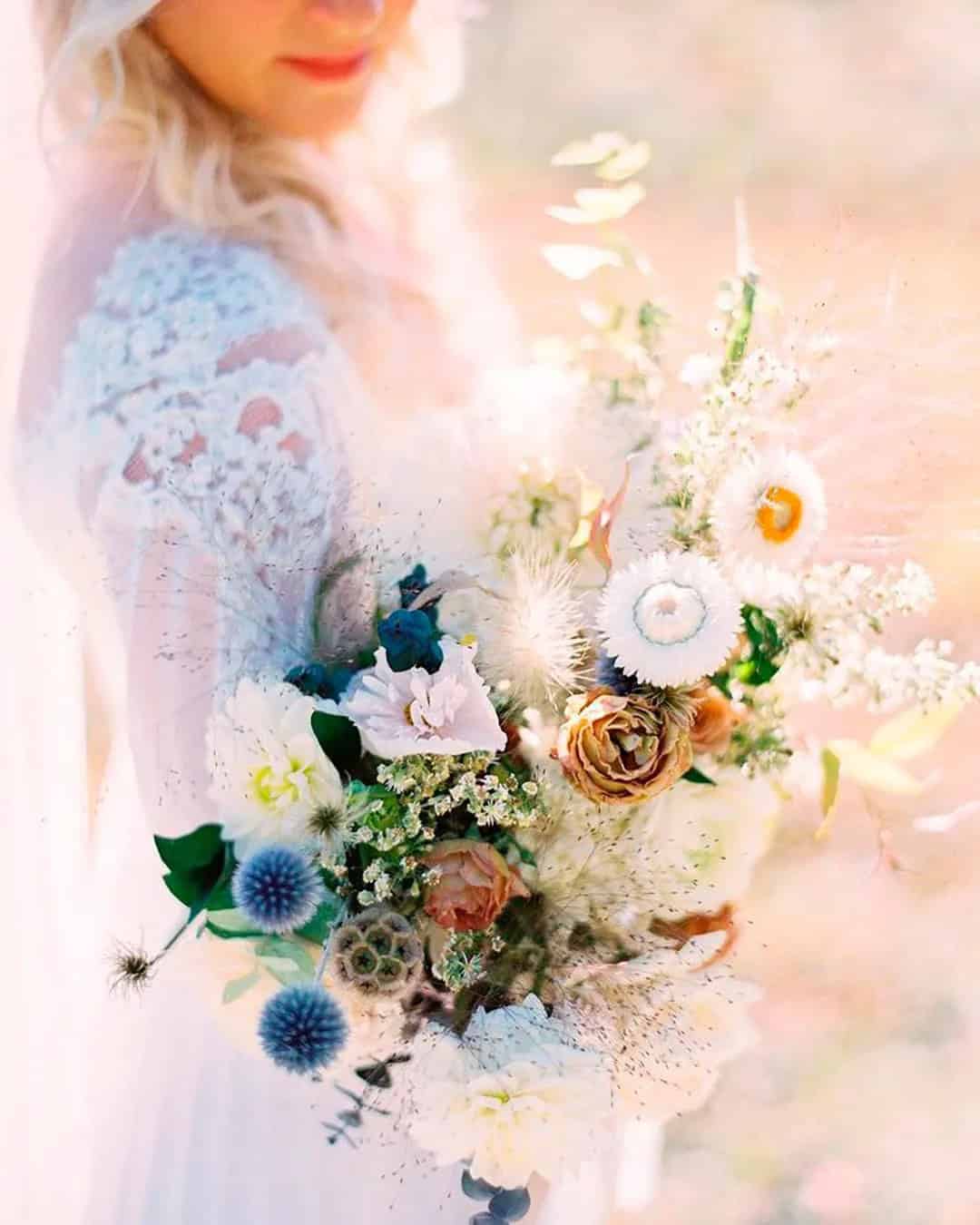
Jewel Tones
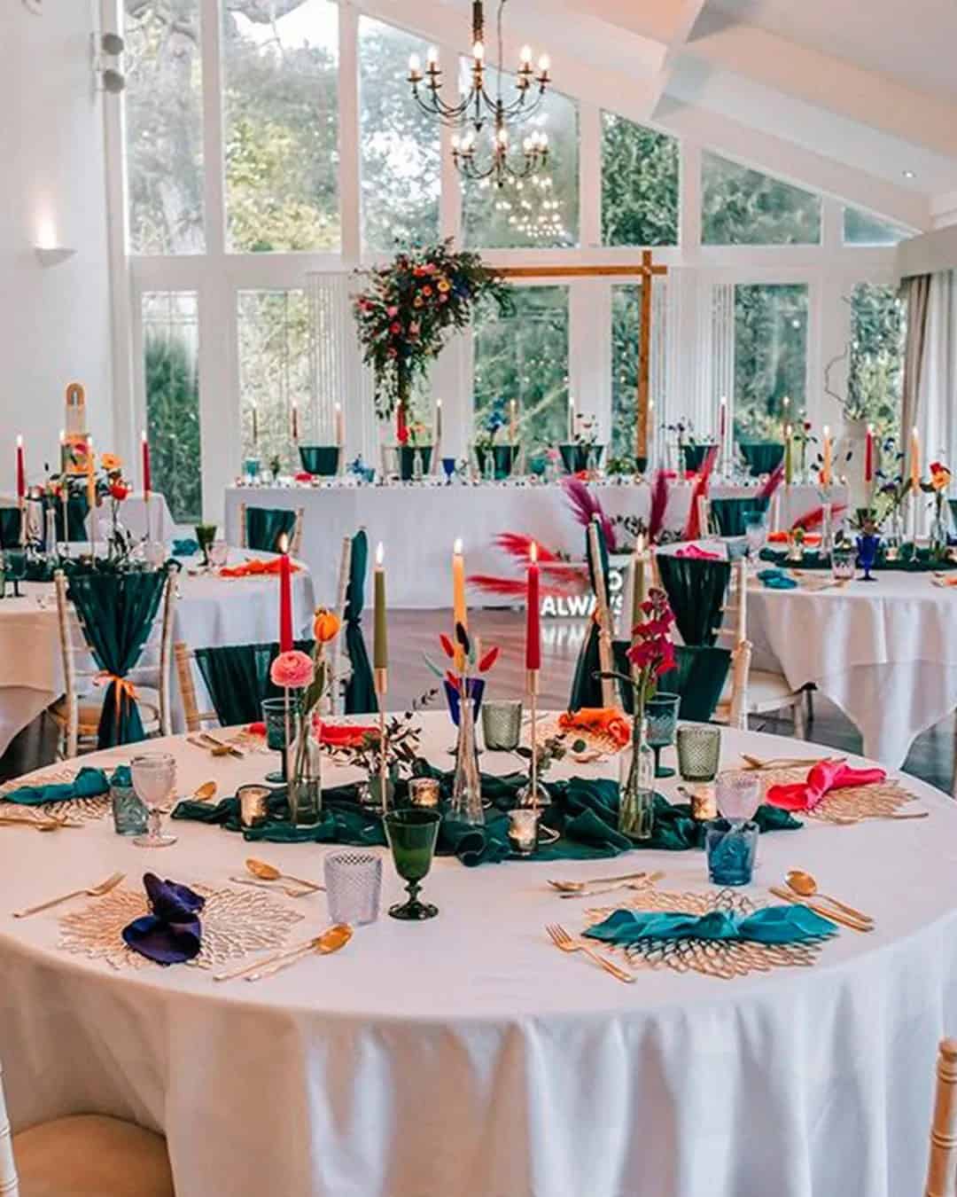
Jewel-toned hues like emerald, ruby, citrine, amethyst, and jade bring an air of mystique to winter and fall wedding celebrations. These rich colors are perfectly suited to the romantic atmosphere of these seasons, evoking images of castle weddings or intimate winery gatherings. When it comes to styling your big day, jewel tones offer endless possibilities for creativity. For a truly show-stopping look, incorporate citrine yellow accents through torches or lanterns to add a pop of energy.
Mixing and matching different jewel-toned elements, such as pairing chairs in complementary hues, can also create a visually stunning atmosphere. Deep-colored florals arranged on your wedding arch or incorporating pale sprinkles for added texture are both excellent ways to bring your theme to life. And why not take the cue from nature? Have your bridesmaids don ruby dresses and adorn them with bouquets featuring emerald, citrine, amethyst, and jade blooms.
When it comes to choosing your bridal jewelry, feel free to pick your favorite jewel tone to serve as a crowning glory for your overall aesthetic.
Hazelnut + Island Paradise + Lapis + Copper
This unconventional color combination is a game-changer for weddings. Let’s break it down: Lapis lazuli, island Paradise, and copper create a striking triad that defies traditional wedding norms. Perfect for modern Bohemian couples embracing minimalism, this palette screams summer vibes. To bring this desert-meets-sky-meets-water-inspired look indoors, consider these styling tips:* Use polished hazelnut furniture to keep decor understated yet chic.
* Source lapis-colored dinnerware and copper napkins for a pop of color.* Adorn chairs with island Paradise and lapis ribbons, mirroring the tablescapes’ hues. Fill lapis vases with a mix of copper, pink, and island Paradise blooms for added visual interest.* Alternate bridesmaids’ dresses between island Paradise and hazelnut tones.* Groomsmen can opt for copper or gray suits paired with hazelnut ties, completing the look.
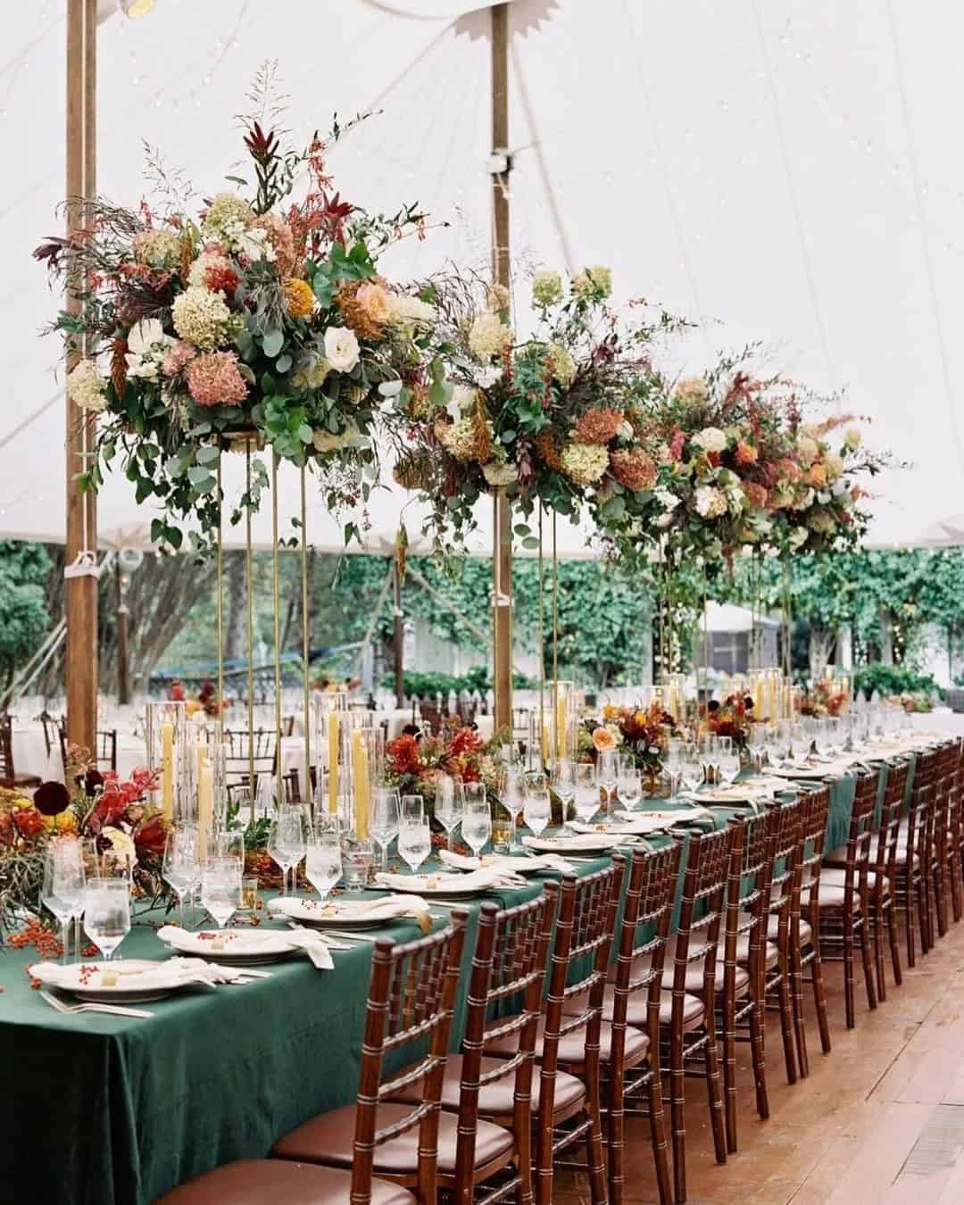
Greenery + Burgundy + Flame + Dogwood
This vibrant color palette is a harmonious blend of brightness, sharpness, life, and calmness, where each shade complements the next to create a cohesive energy. The combination would be perfect for a casual-style museum wedding, suitable for every season of the year.
To achieve this look, start with dogwood as the base color, which sets the tone for a laid-back atmosphere.
Use flowing dogwood tablecloths for the reception setting and pair them with greenery along the tables and pops of flame accents. Add silverware, burgundy napkins, and flame place cards to bring everything together.
In terms of floral arrangements and centerpieces, combine more greenery with flame, burgundy, and dogwood to create stunning displays. For attire, dress the bridesmaids in burgundy and groomsmen in dogwood.
Top it all off with a tiered cake iced in dogwood, featuring decorative accents in greenery and flame. Don’t forget to incorporate this color palette into your food and drink options for a truly memorable event.
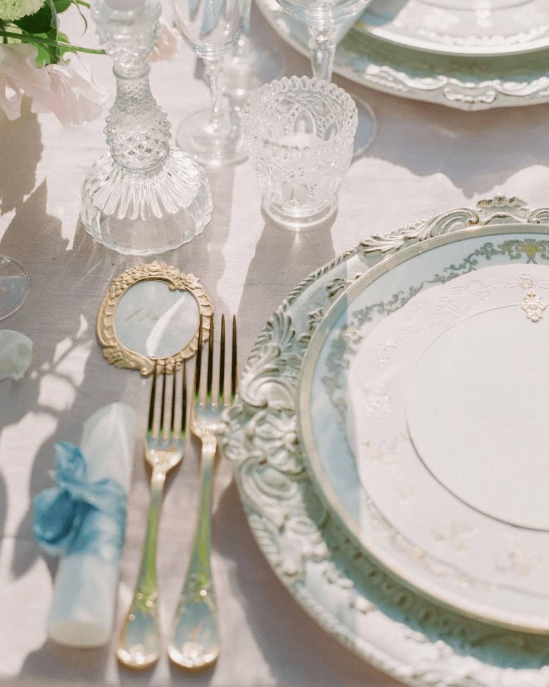
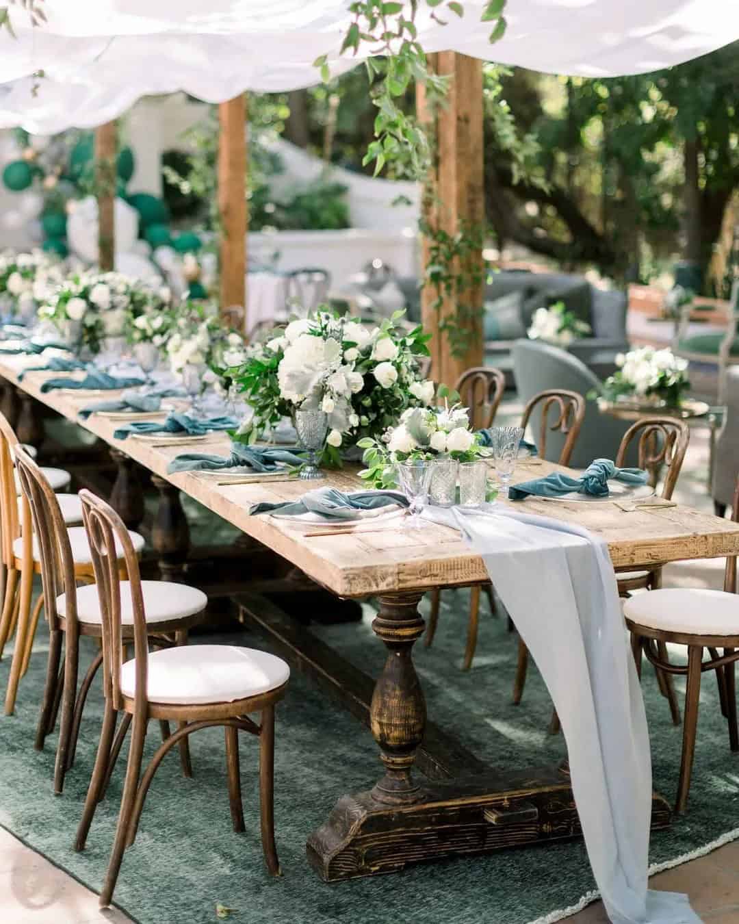
Ivory + Silver + Green
This stunning colour combination has gained immense popularity for weddings, offering a harmonious blend of earthy tones. When used correctly, it can create a warm and inviting atmosphere perfect for intimate spring celebrations. Whether you’re envisioning an outdoor or indoor wedding in a hall, loft, backyard, or home with a nature-inspired theme, this palette is sure to impress. To make the most of this combination, aim to set the tone for a playful and romantic affair.
The bright, natural hues are perfect for creating a whimsical ambiance that will leave your guests enchanted. For the grooms, consider bold moves like deep green suits paired with ivory ties, while bridesmaids can shine in matching green dresses and silver shoes. To bring everything together, incorporate green and ivory bloom bouquets adorned with subtle silver accents into your decor.
Carry this theme through to your centerpieces by using transparent vases and extending the same arrangement to your place settings. Pair polished silver dinnerware with green napkins, complemented by silver candle holders and ivory candles. Finally, make your stationery and cake in ivory and add a touch of green for an added pop of colour.
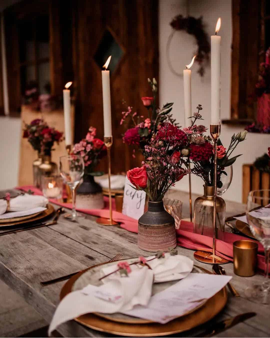
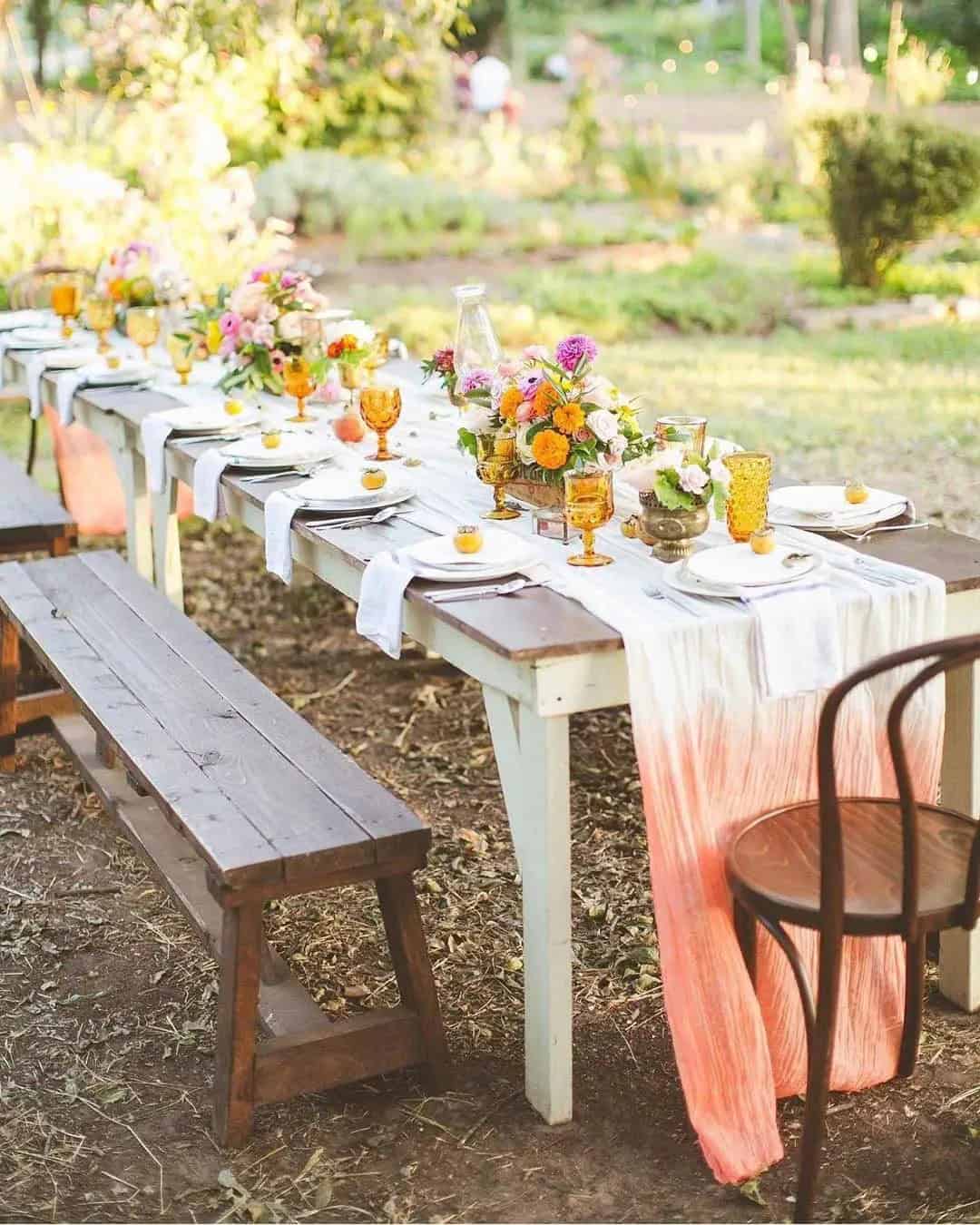
Apricot + Sage + Greige + Navy
The essence of nature is infused into this color palette, courtesy of the vibrant edible apricot. To achieve harmony, balance with Greige’s soft nuances. Follow our styling tips to bring this unique combination to life.
Perfect for fall weddings, this rustic yet sophisticated theme is ideal for terraces and restaurant receptions. The interplay between warm apricot, cool sage, navy’s depth, and Greige’s balance creates a romantic ambiance.
Start with Greige as your base and complement it with the other three colors.
Envision your bridesmaids in navy or sage dresses, adding a pop of color to your overall aesthetic. For arch decor and crowns, create garlands featuring apricot, sage, and navy hues. Navy suits for the gentlemen, paired with greige boutonnieres, will add a touch of elegance.
For venue decor, hang Greige curtains adorned with apricot and navy accents.
Stationery and napkins in Greige, complete with navy lettering, will tie everything together. Centerpieces and desserts can feature a delightful combination of these colors, further enhancing your rustic-chic theme.
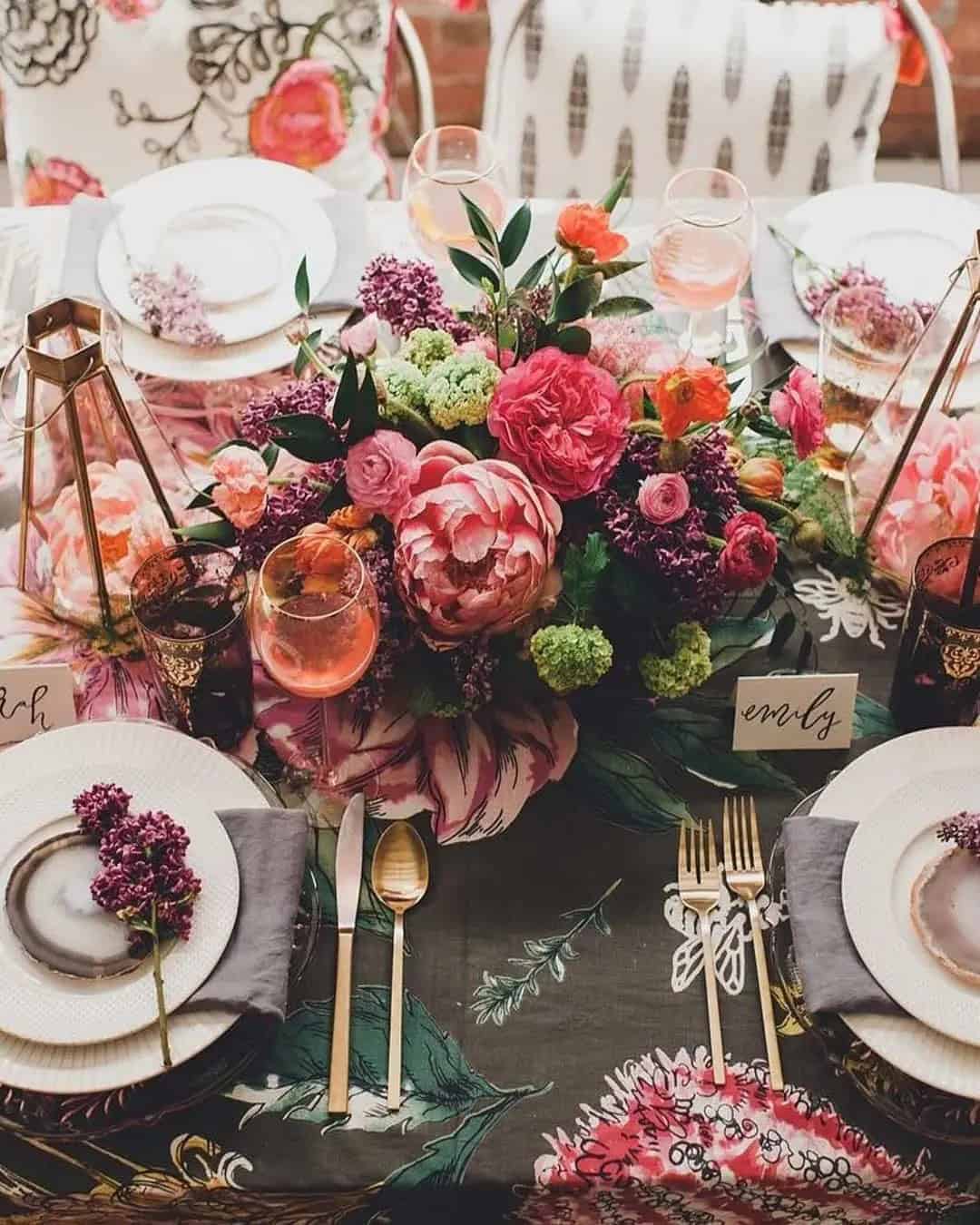
Mint + Pink + Coral + Magenta
The essence of whimsy and romance is captured in this unique color palette, reminiscent of a warm summer’s day. With its delicate blend of mint, pink, coral, and magenta hues, it’s the perfect accompaniment to rustic-themed weddings set amidst picturesque villa, conservatory, or barn backdrops.
This palette’s versatility lies in its ability to evoke feelings of joy and playfulness. To bring it to life, consider pairing mint dresses for the bridesmaids with coral, pink, and magenta bouquets.
The grooms can sport coral suits complemented by mint ties or magenta boutonnieres.
Carry the theme throughout the wedding by incorporating mint stationery with pink accents, and use a combination of mint linens, coral dinnerware, and clear glassware to add depth to the reception tables. For added visual interest, fill vases with vibrant coral poppies, pink roses, and mint blooms.
To create a sense of drama, incorporate floating candles that catch the eye.
And for a touch of whimsy, design coral favor bags with magenta accents. Finally, complete the look with mint-colored cakes and thoughtful combo designs that reflect the couple’s unique style.
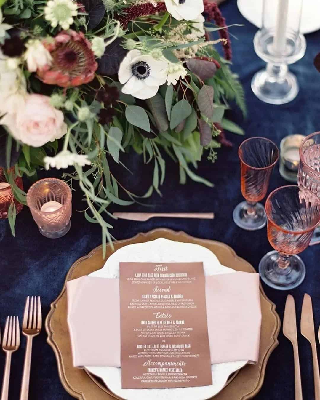
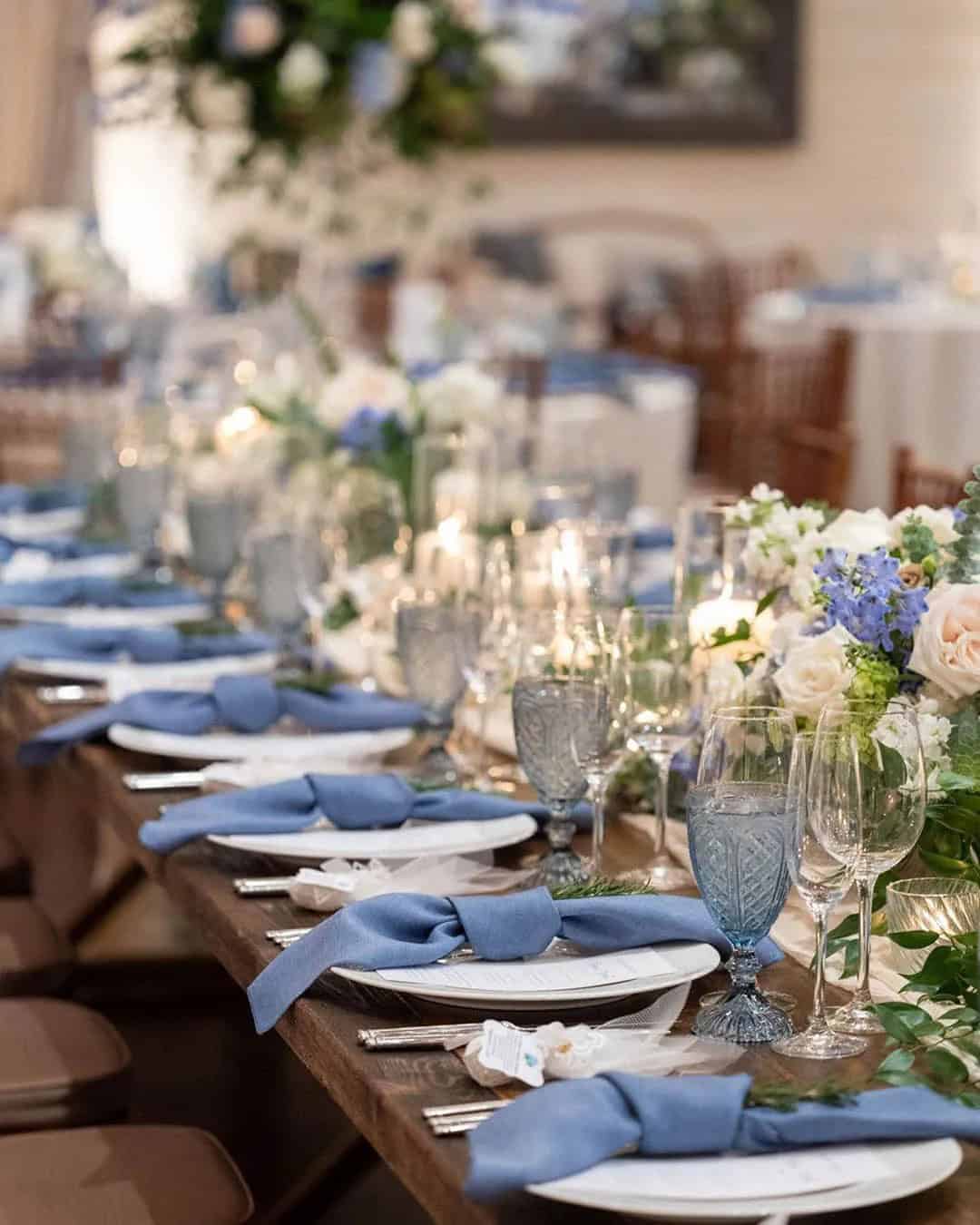
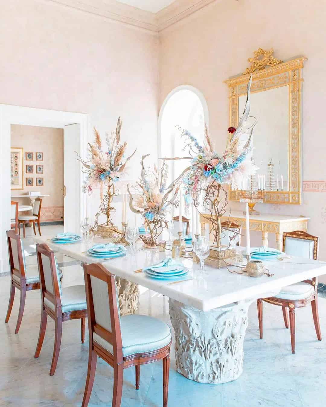
Blush + Gold + Blue + Navy
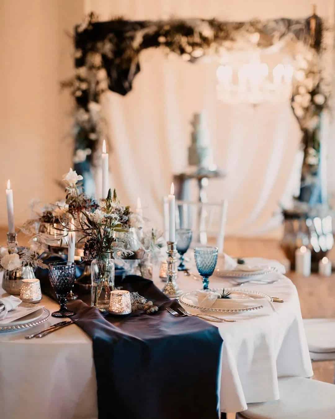
With the perfect balance of warm blush, dramatic blue, and proper navy, this wedding color combination is a timeless choice that works well for any season. The addition of gold adds an extra layer of elegance and luxury to the overall aesthetic.
This palette is ideal for a vintage-themed cruise wedding, where you can incorporate elements like navy suits with blush or gold ties, navy bridesmaid dresses, and corsages, bouquets, and boutonnières featuring blush, navy, and gold accents tied together with blue ribbons. To carry this look through to the reception, consider flooding tables with blue tablecloths, using gold flatware, and adding blush napkins.
For stationery, choose navy with gold edges and lettering, and finish off the look with a blush tiered cake. With so many unique color combinations to choose from, it can be overwhelming to decide on just one. However, each palette has its own distinct flavor, personality, and feel, making it easy to find the perfect match for your special day. Take inspiration from our collection of wedding color combos and create a look that’s uniquely you.