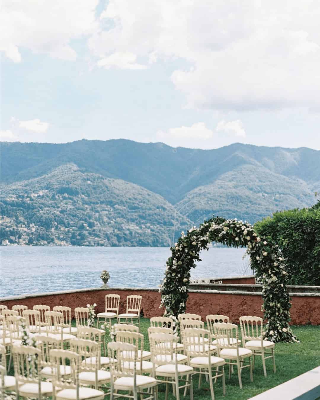
Looking for wedding palette inspiration? Why not draw from the Pantone color of the year archives? Spanning over two decades, this collection showcases a diverse range of colors that can serve as a starting point for your special day. From soft and subtle to bold and vibrant, there’s something for everyone. To get started, take a look at our list below featuring every Pantone Color of the Year from 2000 to 2023.
With such a vast array of options, you’re sure to find a color combination that sparks your creativity and sets the tone for an unforgettable celebration.
Pantone Colors of the year include:
2024: Peach Fuzz
2023: Viva Magenta
2022: Very Peri
2021: Illuminating and Ultimate Gray
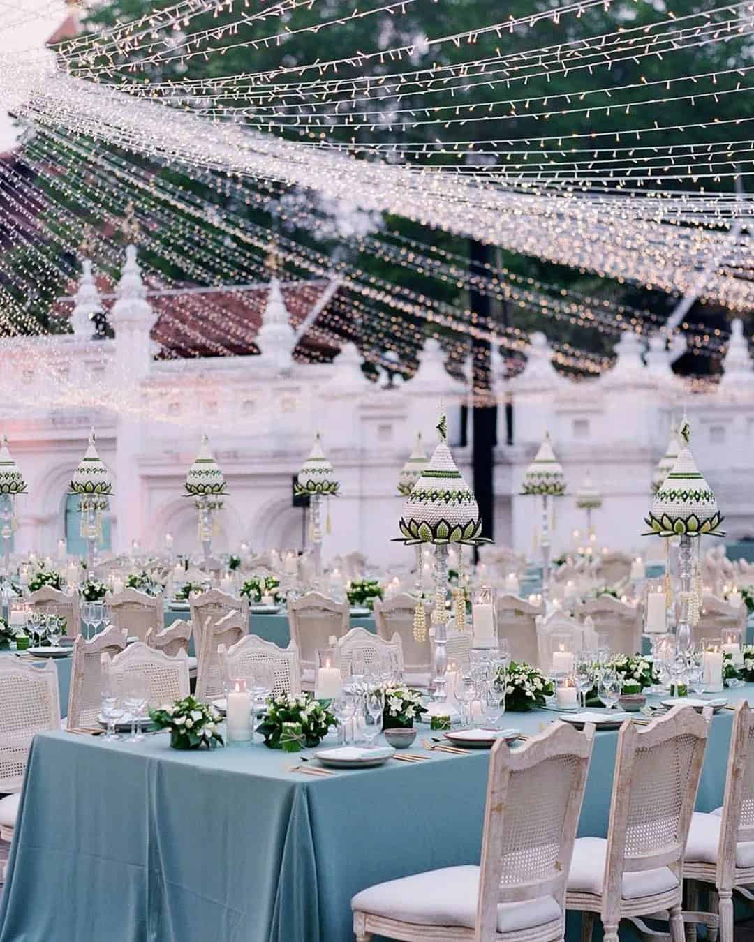
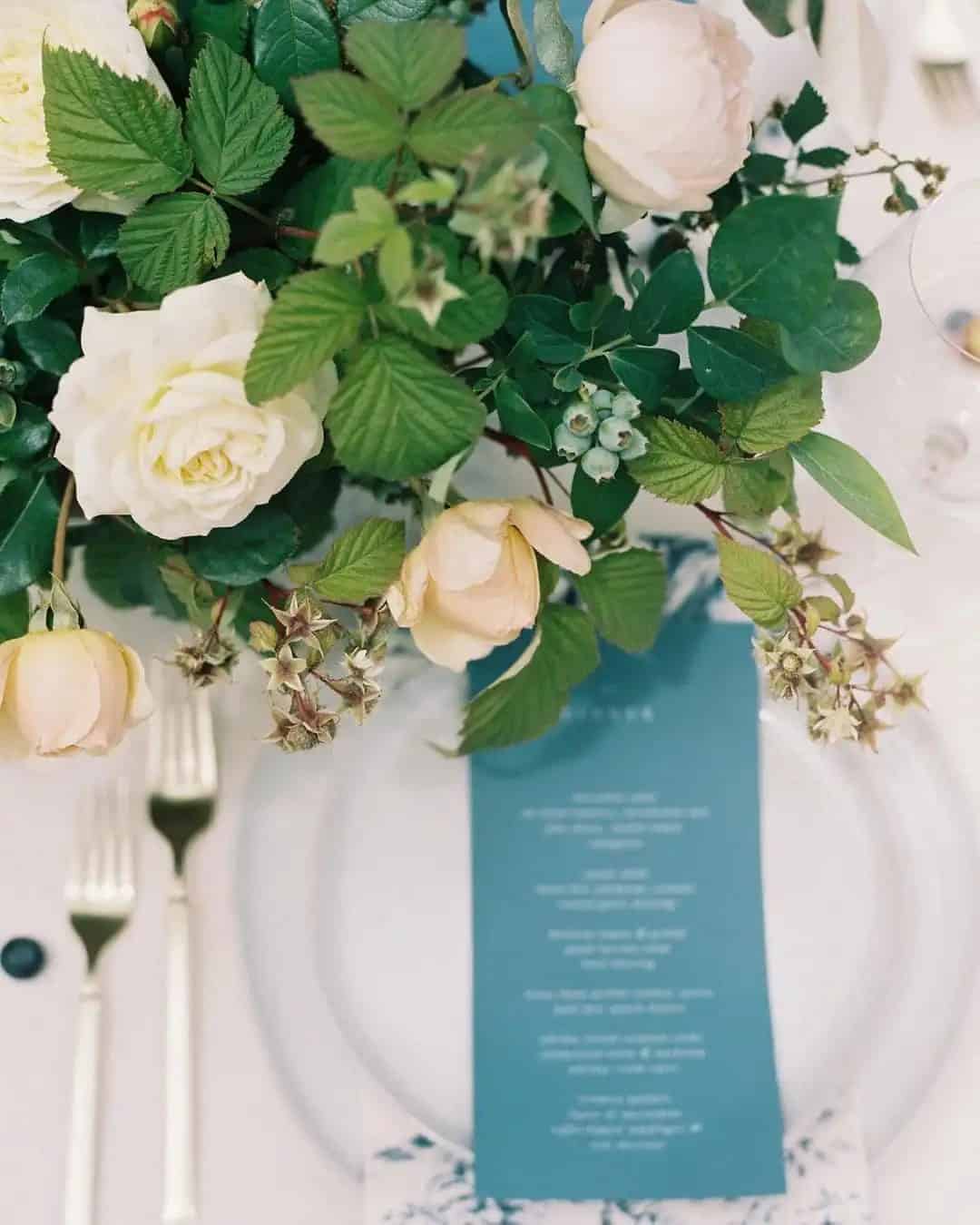
2020: Classic Blue
2019: Living Coral
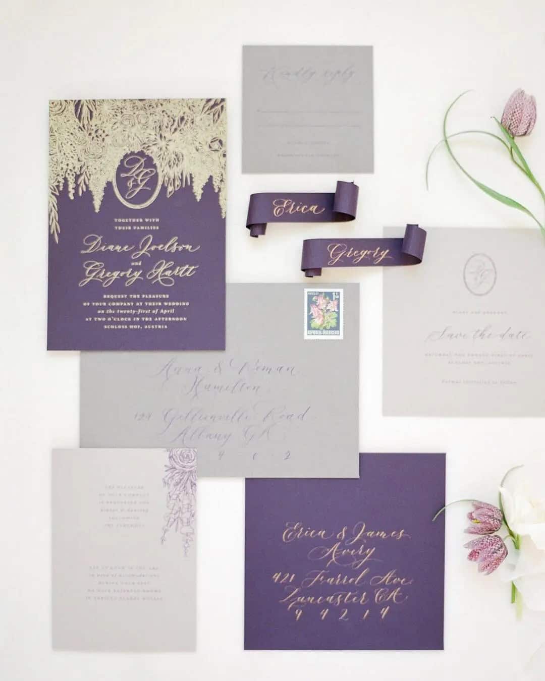
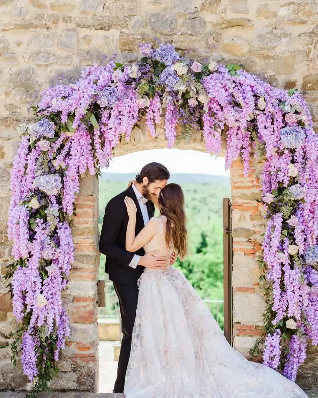
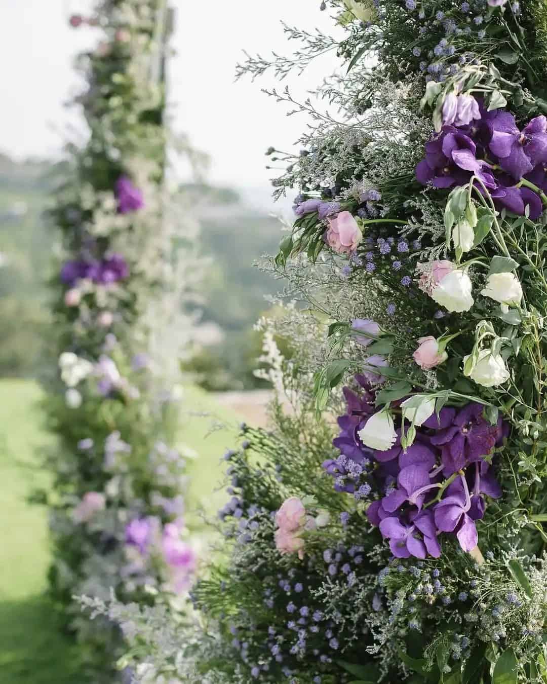
2018: Ultra Violet
2017: Greenery
2016: Rose Quartz and Serenity
2015: Marsala
2014: Radiant Orchid
2013: Emerald
2012: Tangerine Tango
2011: Honeysuckle
2010: Turquoise
2009: Mimosa
2008: Blue Iris
2007: Chili Pepper
2006: Sand Dollar
2005: Blue Turquoise
2004: Tiger Lily
2003: Aqua Sky
2002: True Red
2001: Fuchsia Rose
2000: Cerulean
Brides Often Ask
When did Pantone start color of the year?
Since its inception in 2000, the Pantone Color of the Year has become a highly anticipated and influential event in the design world. The annual selection is meant to reflect the current mood and cultural climate, offering designers and brands a guiding light for their color choices throughout the year.
How is Pantone Color of the year chosen?
Each year, Pantone’s expert team embarks on a comprehensive analysis to identify the most prominent color trend. In their research, they scrutinize various indicators such as fashion, marketing strategies, political influences, and social media movements, carefully weighing the significance of each factor to pinpoint the Color of the Year.
What is the wedding color of the year?
For the first time in history, Peach Fuzz has been crowned the color of the year 2024. This captivating shade exudes a unique energy that harmonizes with one’s being on a profound level, influencing thoughts, emotions, and physical well-being in a holistic manner.
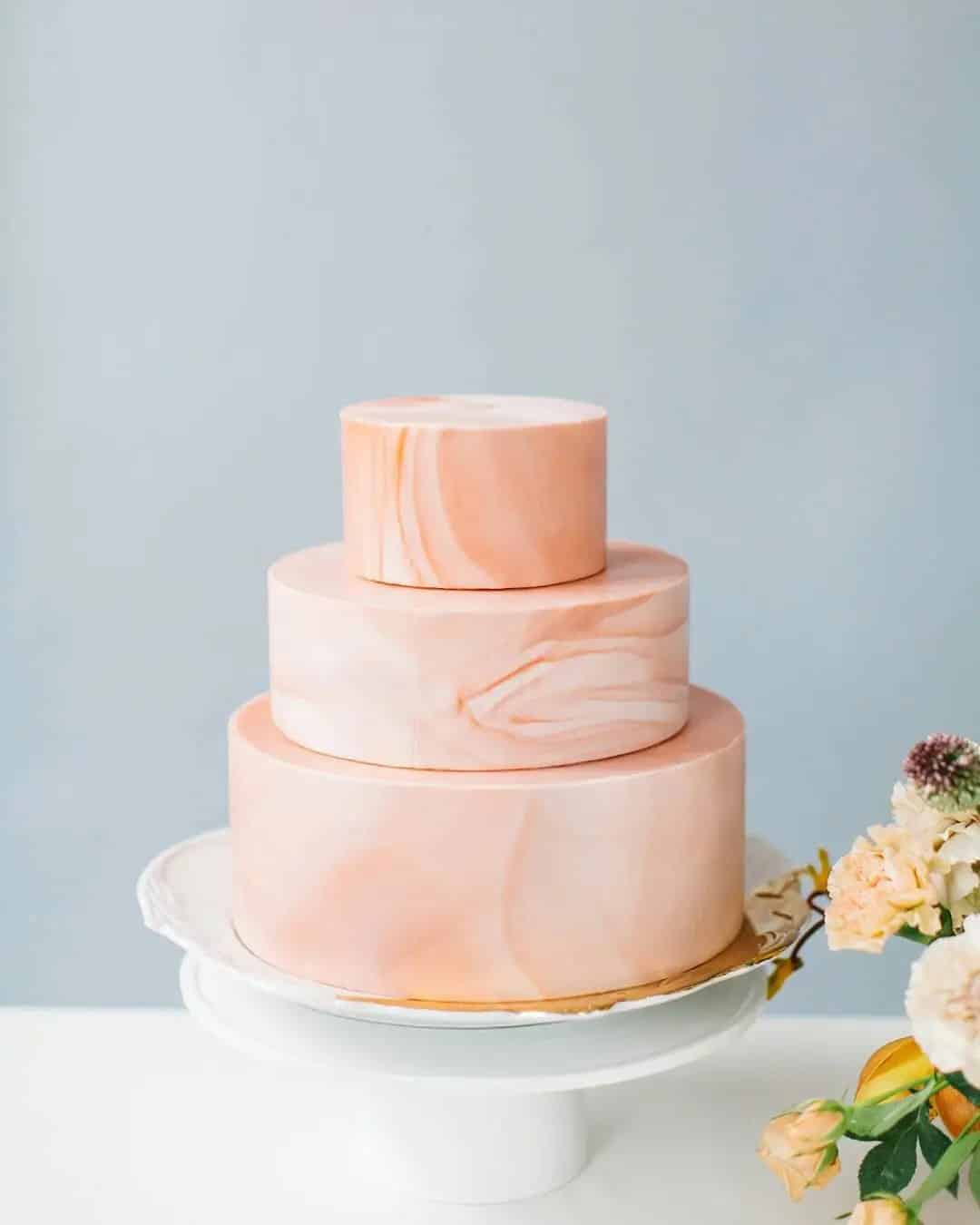
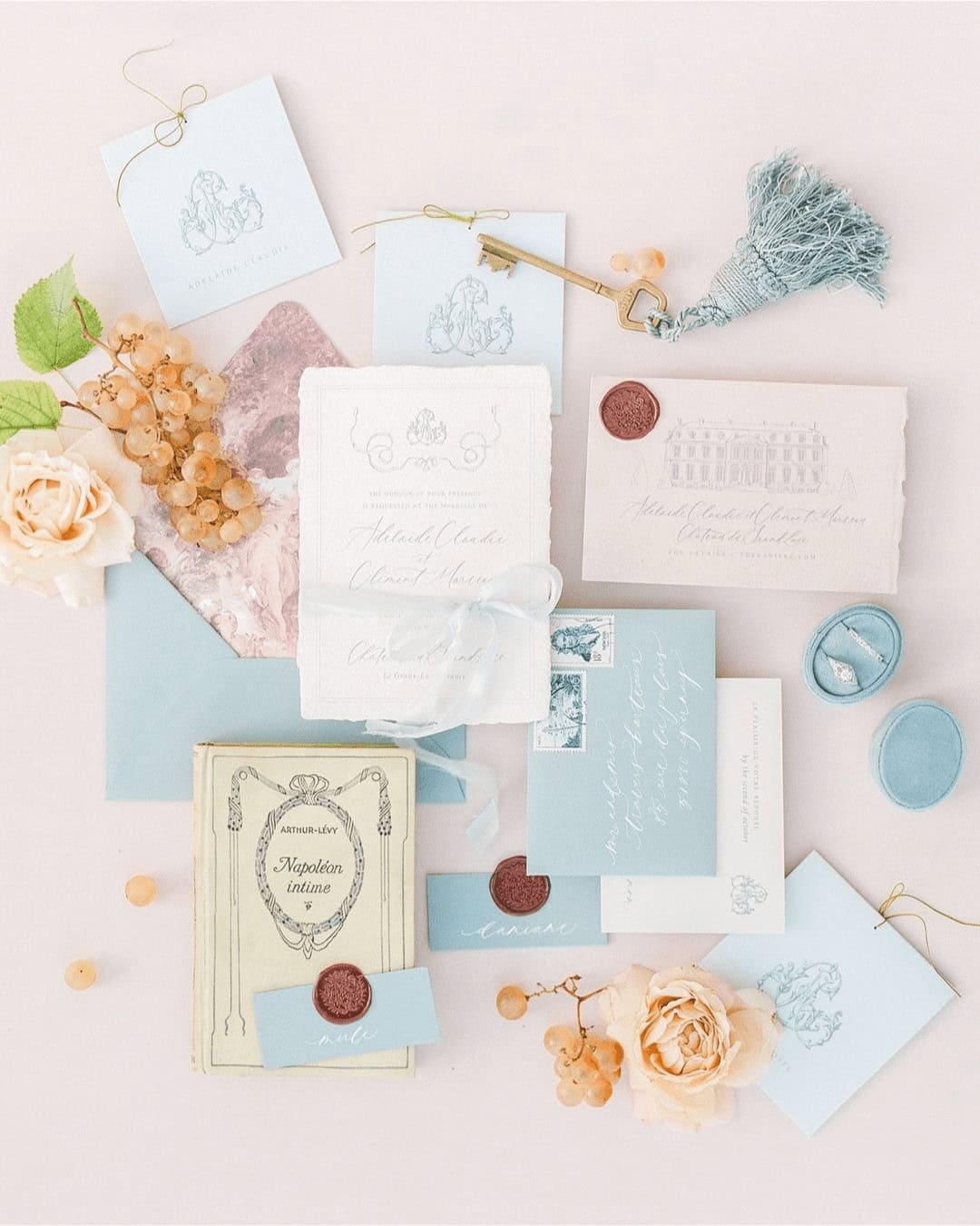
2024 – Peach Fuzz
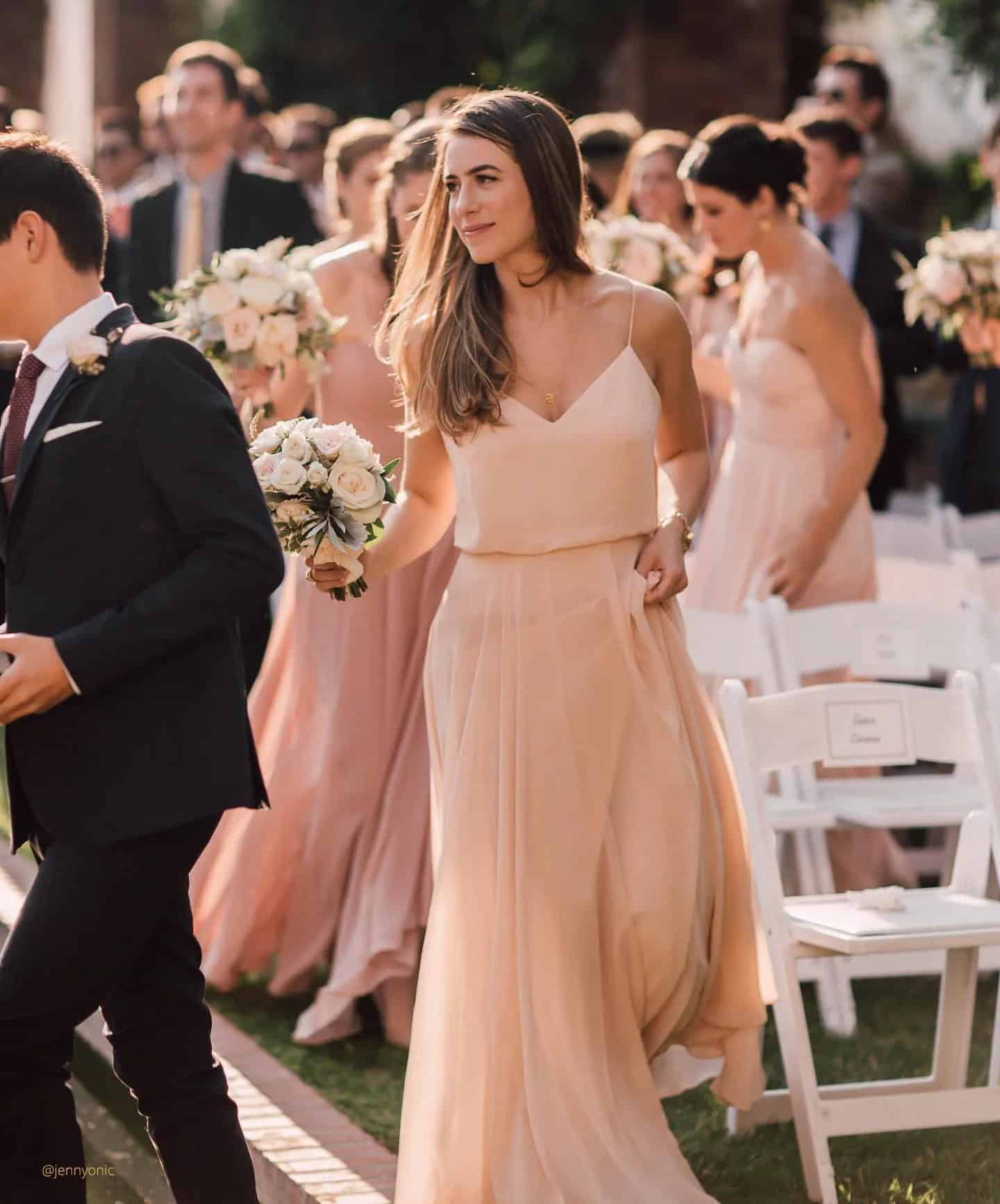
In capturing the essence of a shared desire for self-care and fostering meaningful connections, Peach Fuzz has been thoughtfully selected as the embodiment of holistic well-being. This warm and inviting tone embodies compassion, effortlessly blending youthful vibrancy with timeless elegance. As a symbol of universal needs for warmth, comfort, and connection, Peach Fuzz serves as the perfect foundation for a wedding’s aesthetic identity.
To incorporate this radiant hue into your special day, consider dressing your bridesmaids in flowing gowns that echo Peach Fuzz’s gentle tones, complemented by arrangements featuring peach-hued flowers. Elevate the atmosphere with soft, peach-tinted lighting and carry the theme through stationery, favors, and even sweet treats for a cohesive and sophisticated wedding celebration.
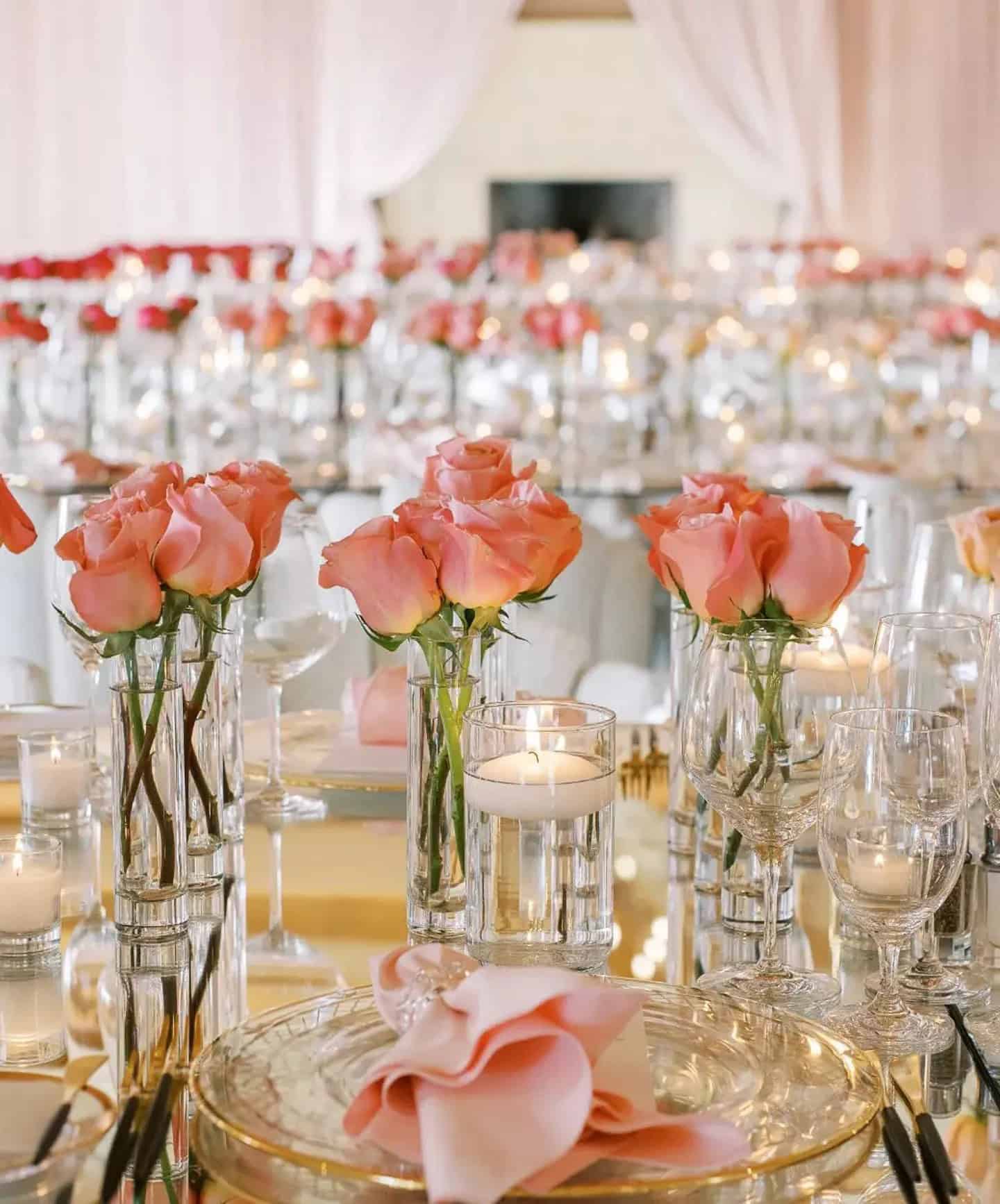
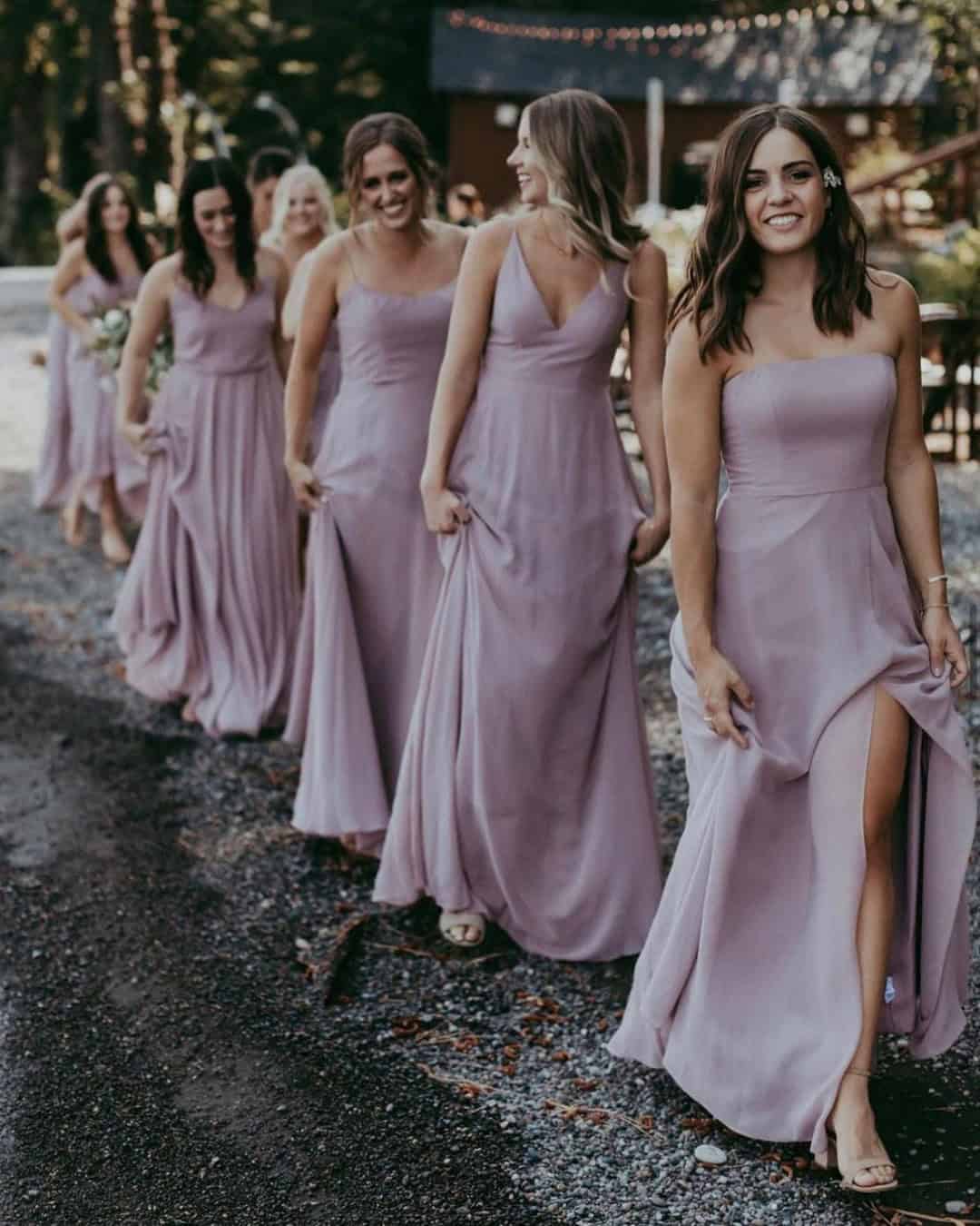
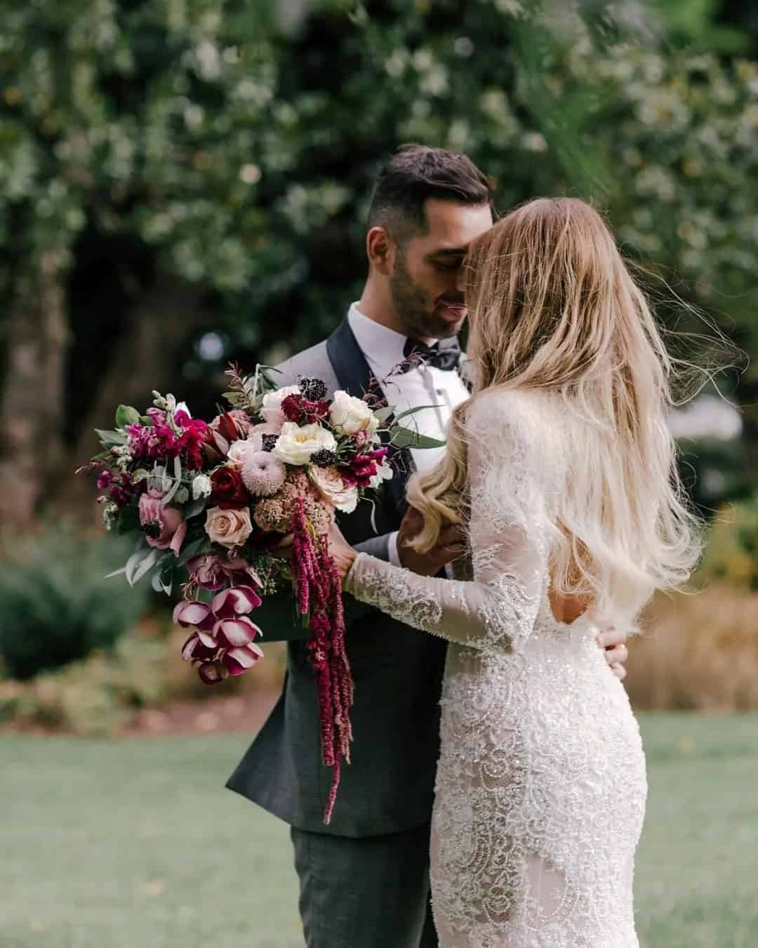
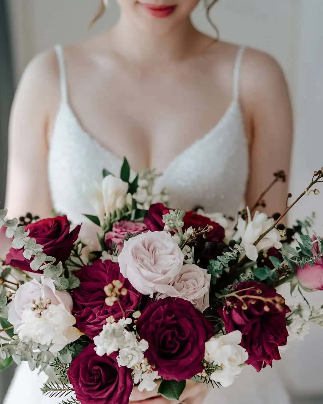
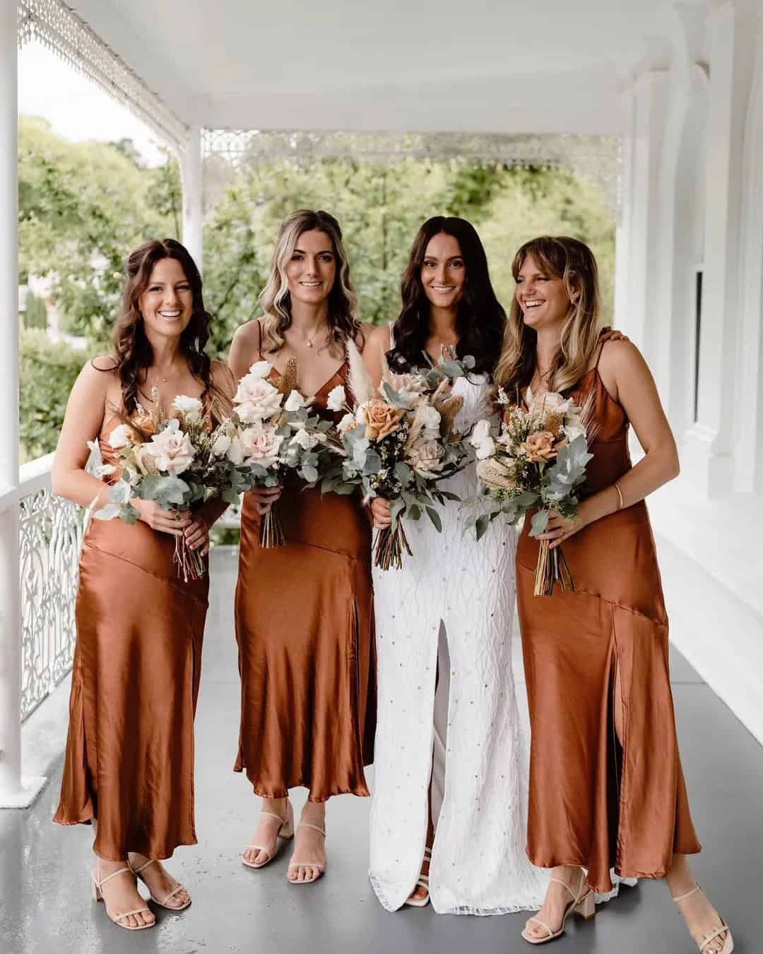
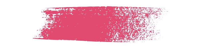
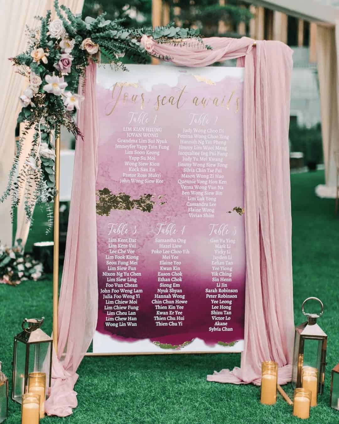
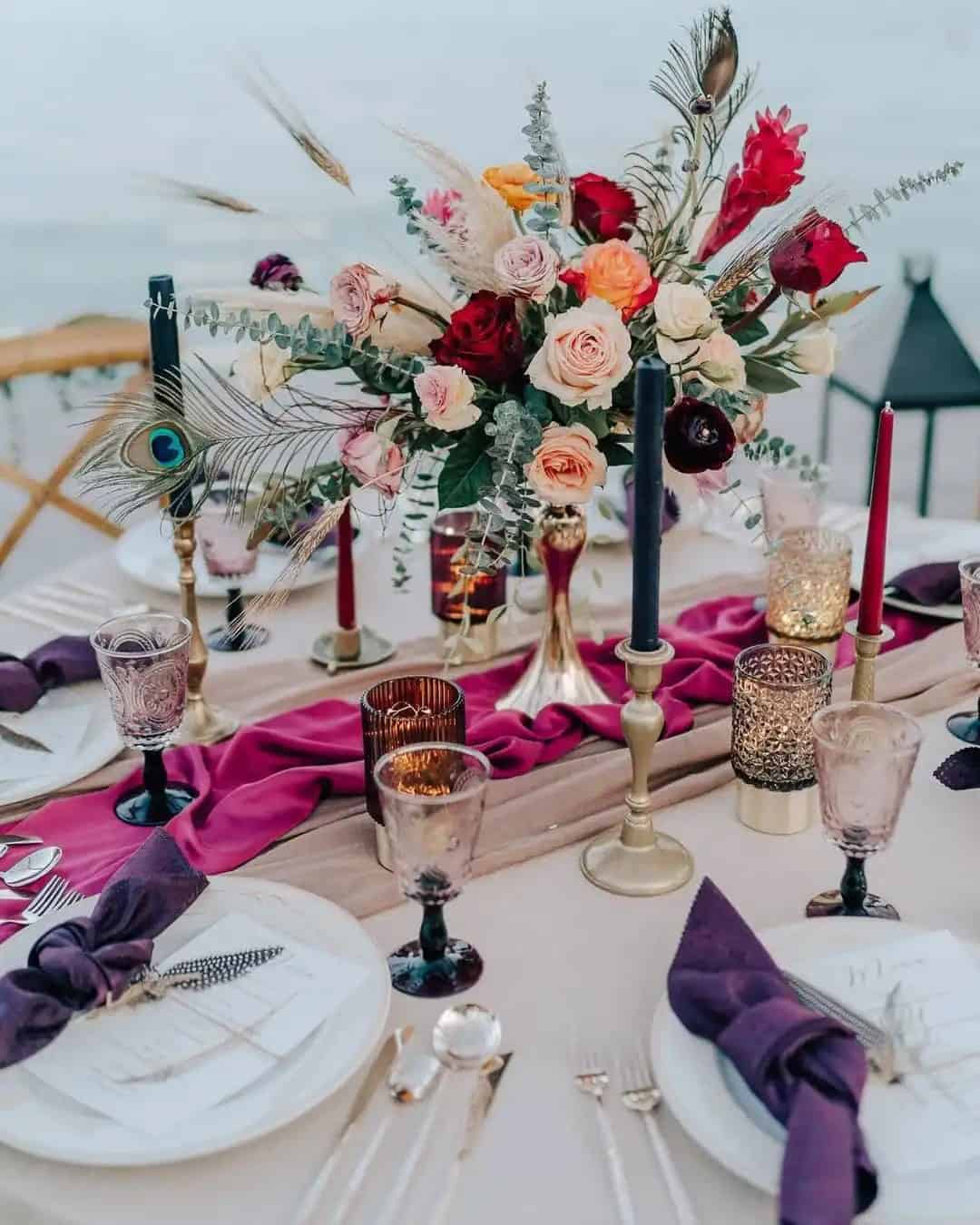
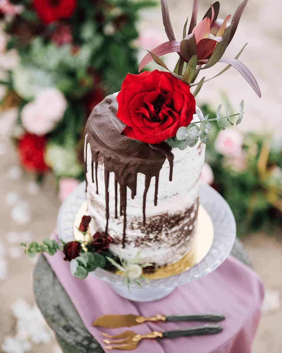
2023 – Viva Magenta
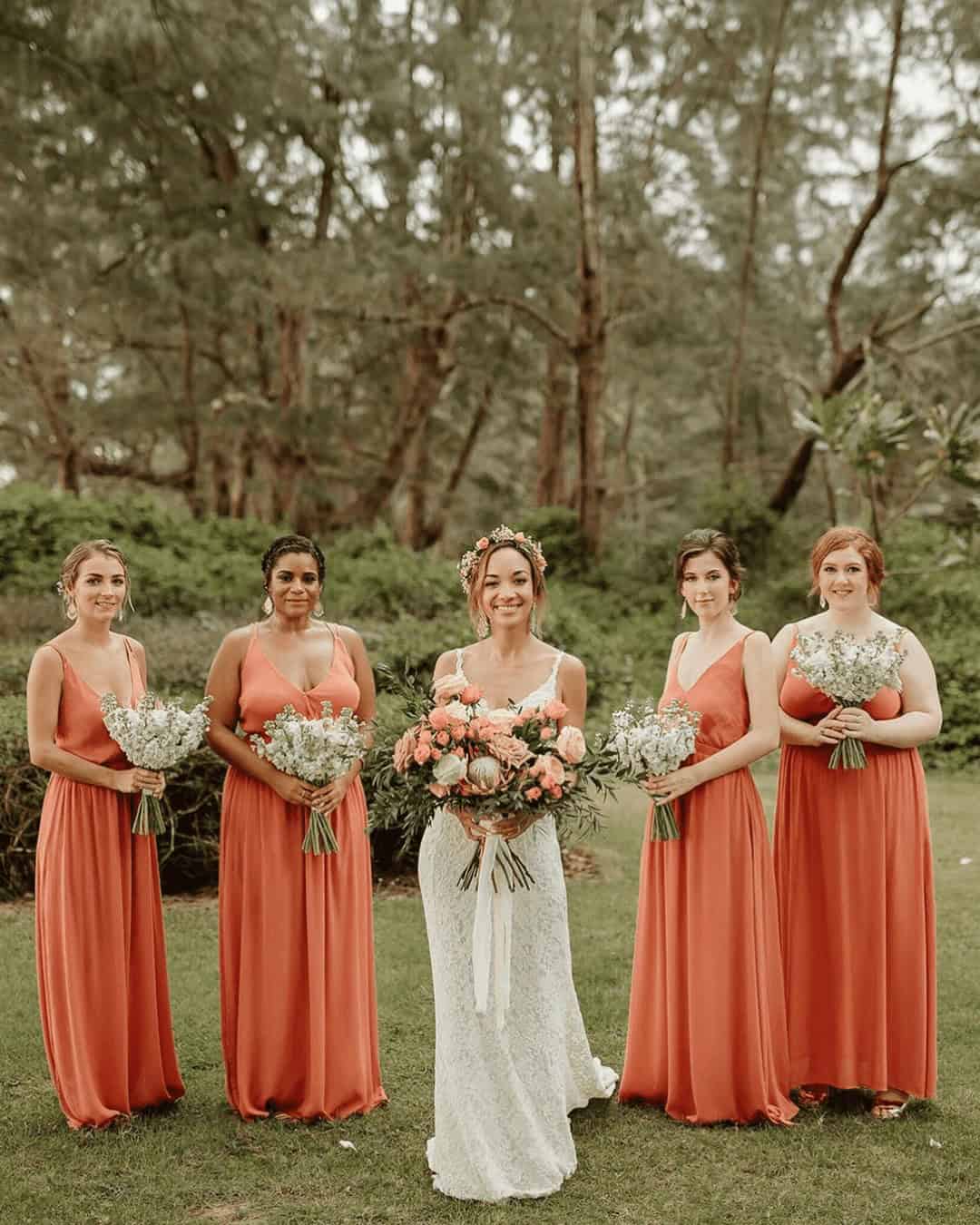
Viva magenta, a dynamic and striking shade, has taken center stage as one of the top fashion and design trends for 2023. The Pantone Color Institute’s latest selection also lends itself to the wedding world, with viva magenta being named the official color of the year wedding for 2023. This captivating hue is characterized by its vibrant pinkish or hot pink undertones, infused with subtle hints of purple, placing it firmly within the red color family.
Described as assertive yet not aggressive, viva magenta pairs perfectly with yellow and turquoise, exuding an air of elegance in dominant color combinations. Its powerful, brave, and fearless essence has made it a staple among royalty, celebrities, influencers, models, and high-society individuals, who have all donned this iconic shade. With its versatility, viva magenta is an ideal choice for bridesmaids’ dresses at weddings, as well as wedding accessories like jewelry and aisle decorations.
The Pantone color of the year history since 2000 has seen numerous trends influenced by their selections, and viva magenta is set to be a major player in this regard.
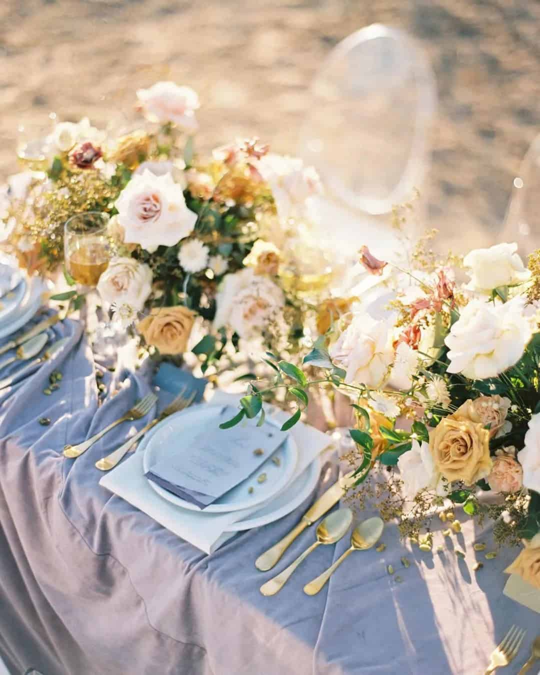
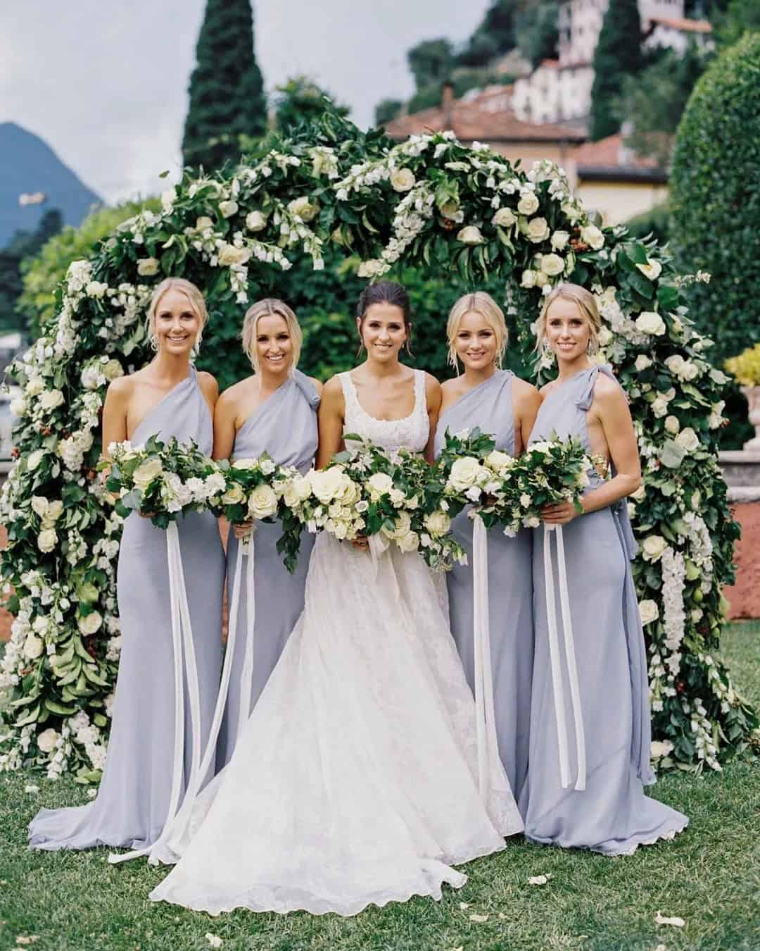
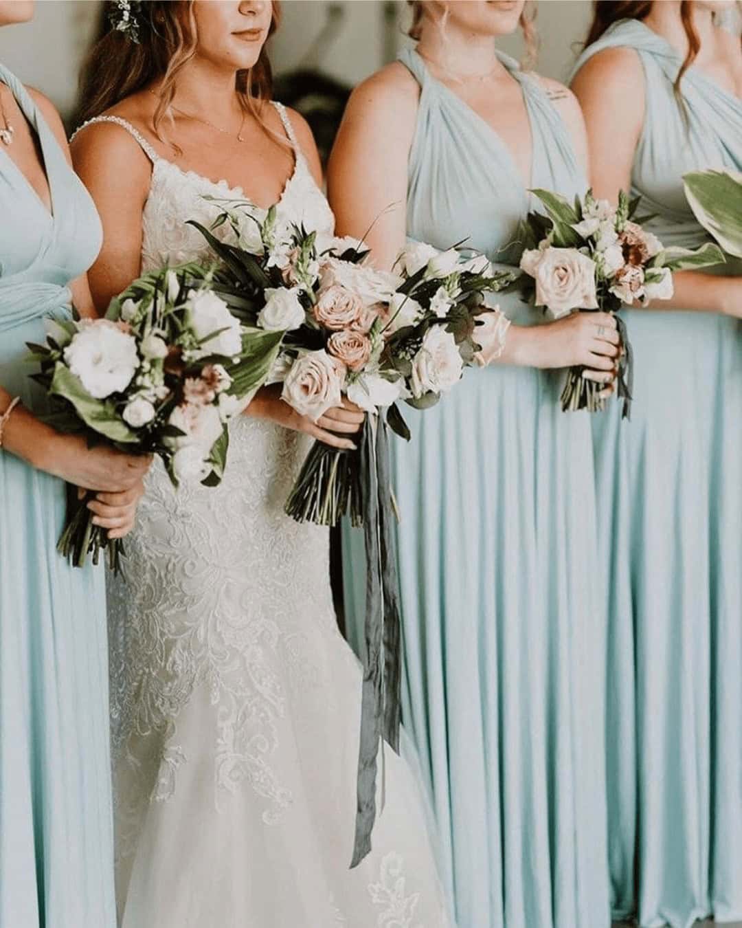
2022 – Very Peri

Veri Peri, the Pantone color of the year 2022, is a captivating blend of violet, blue, and deep red hues. This enigmatic shade embodies creativity, a harmonious balance of cool and fierce, transformation, consistency, positivity, and stability. Its versatility makes it an ideal choice for outdoor weddings by the beach or poolside celebrations. The color’s unique quality is reminiscent of a vibrant periwinkle tone, allowing it to be paired seamlessly with pastels, yellow, and gold.
To incorporate Veri Peri into your wedding design, consider infusing it into your attire, cake, floral arrangement, or arch decor for a truly unforgettable experience.
2021 – Illuminating and Ultimate Gray
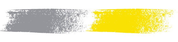
Illuminating and Ultimate Gray – the dynamic duo of 2021’s color palette. This harmonious combination is a masterclass in contrast, where the calming presence of Ultimate Gray provides a serene backdrop for the vibrant, warm yellow tones of Illuminating. Together, they evoke feelings of empowerment, enthusiasm, and reassurance. To take your special day to the next level, consider incorporating these colors into your wedding decor, invitations, and even photo booth props.
For added flair, why not incorporate complementary hues like peach, orange, or green to create a truly unforgettable celebration?
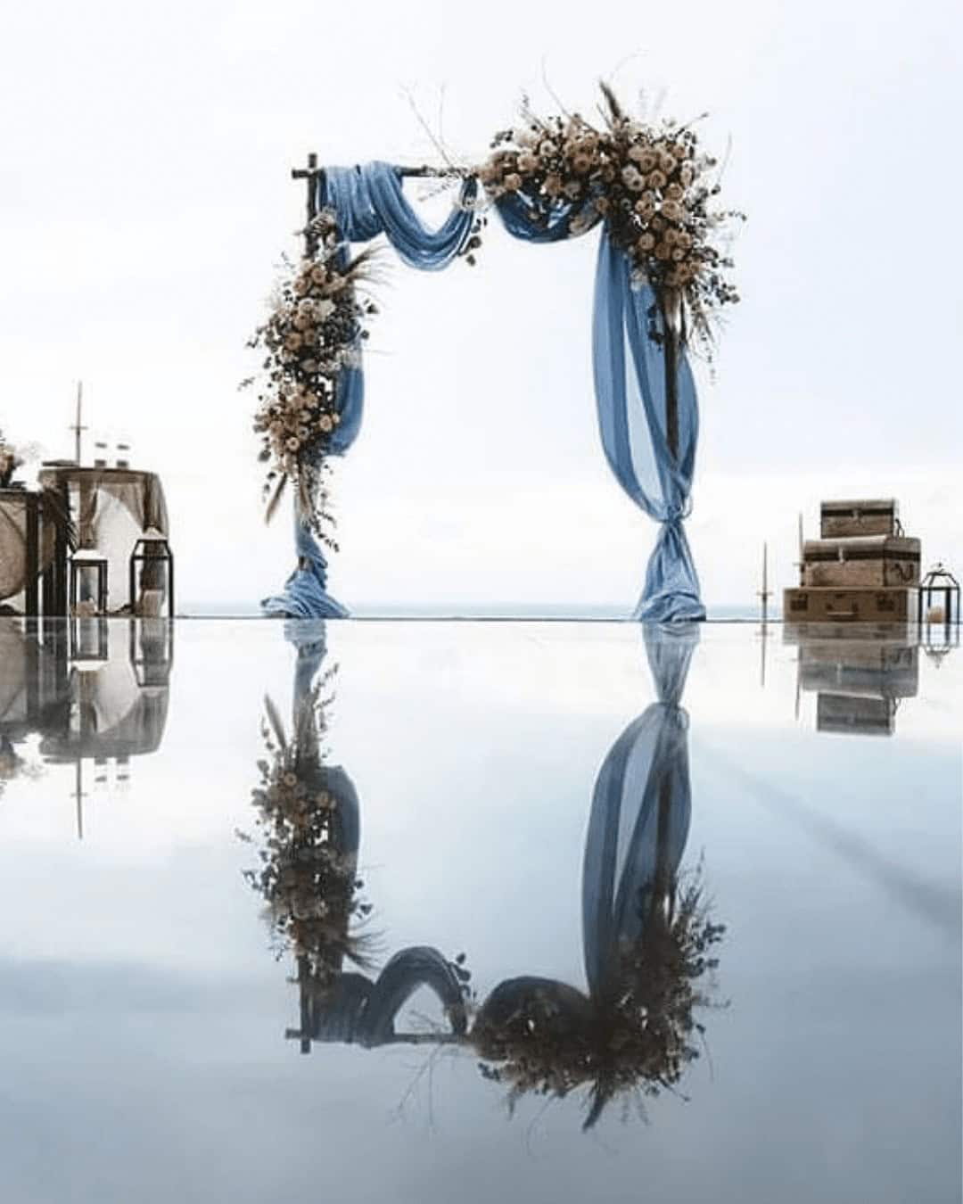
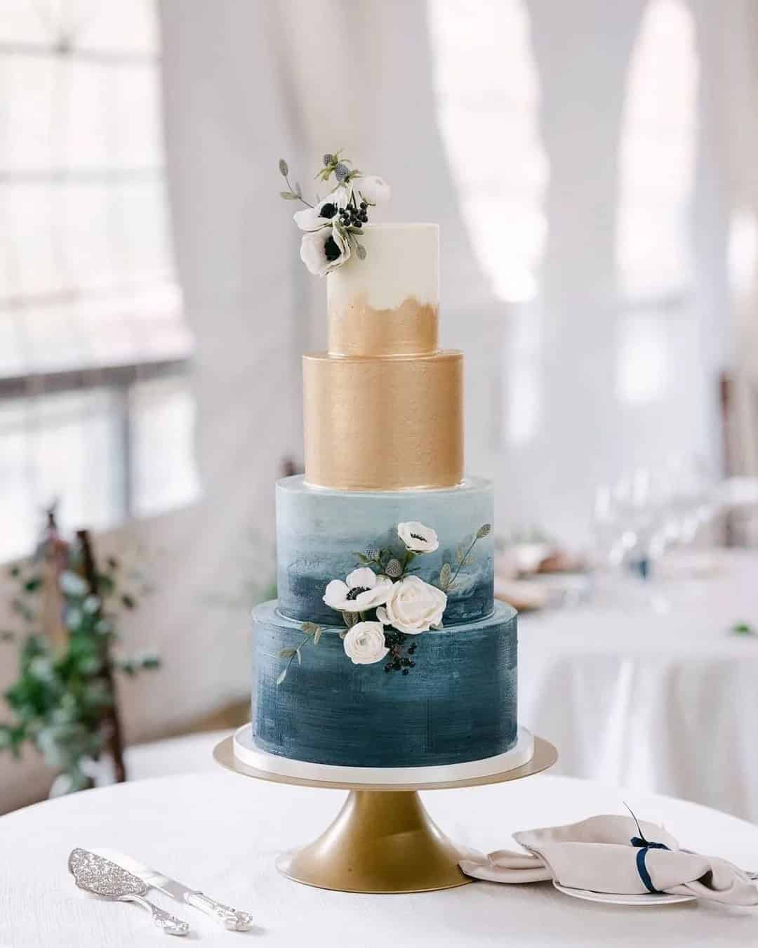
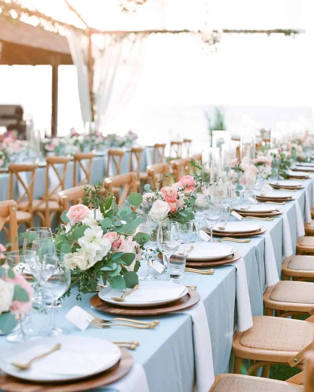
2020 – Classic Blue
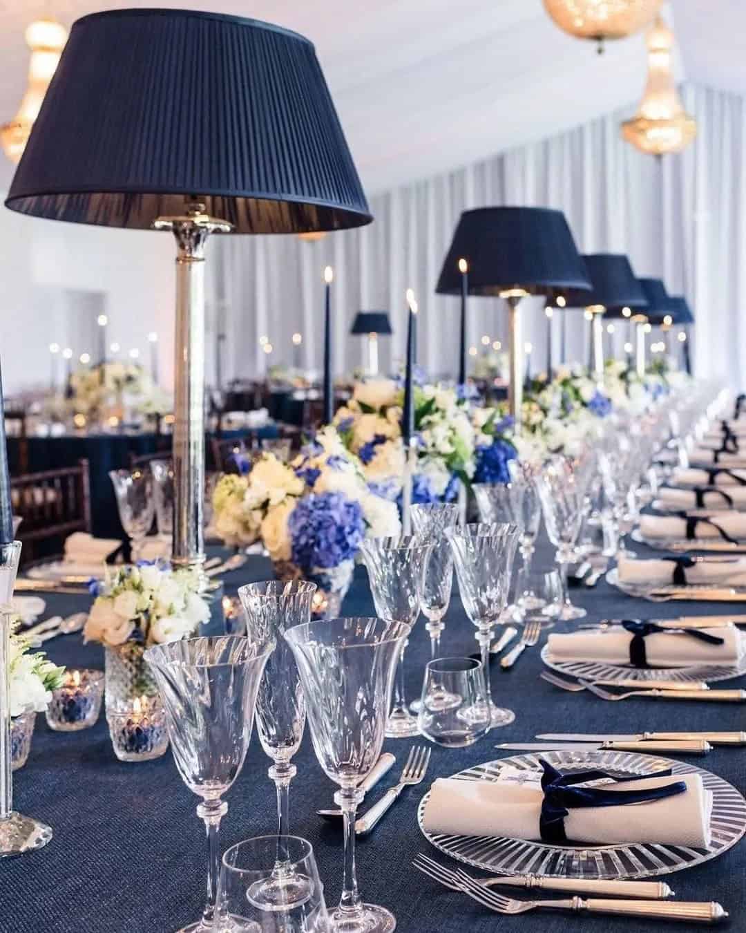
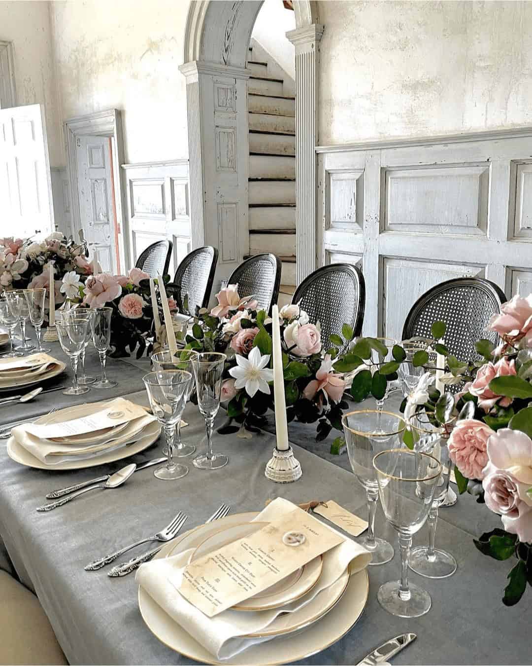
For those seeking Pantone wedding color palettes that exude trustworthiness and dependability, Classic Blue is an excellent choice. This nuanced hue effortlessly transitions from confident to calm and contemplative, with a touch of somberness. When paired with gold, pink, white, or powder blue, Classic Blue creates a vintage-inspired aesthetic perfect for garden and classic weddings.
Its timeless quality lends itself beautifully to stationery, floral arrangements, centerpieces, and even wedding cakes.
2019 – Living Coral
Living Coral is a harmonious blend of calming warmth and energetic vibrancy. When paired with green and blue, this color combination creates a captivating and cozy atmosphere, making it an ideal choice for rustic wedding settings such as deserts, farms, barns, or country landscapes. Bring this palette to life by incorporating the colors into your stationery, cake design, table runners, and arch decor, evoking a sense of serenity and comfort for your guests.
2018 – Ultra Violet
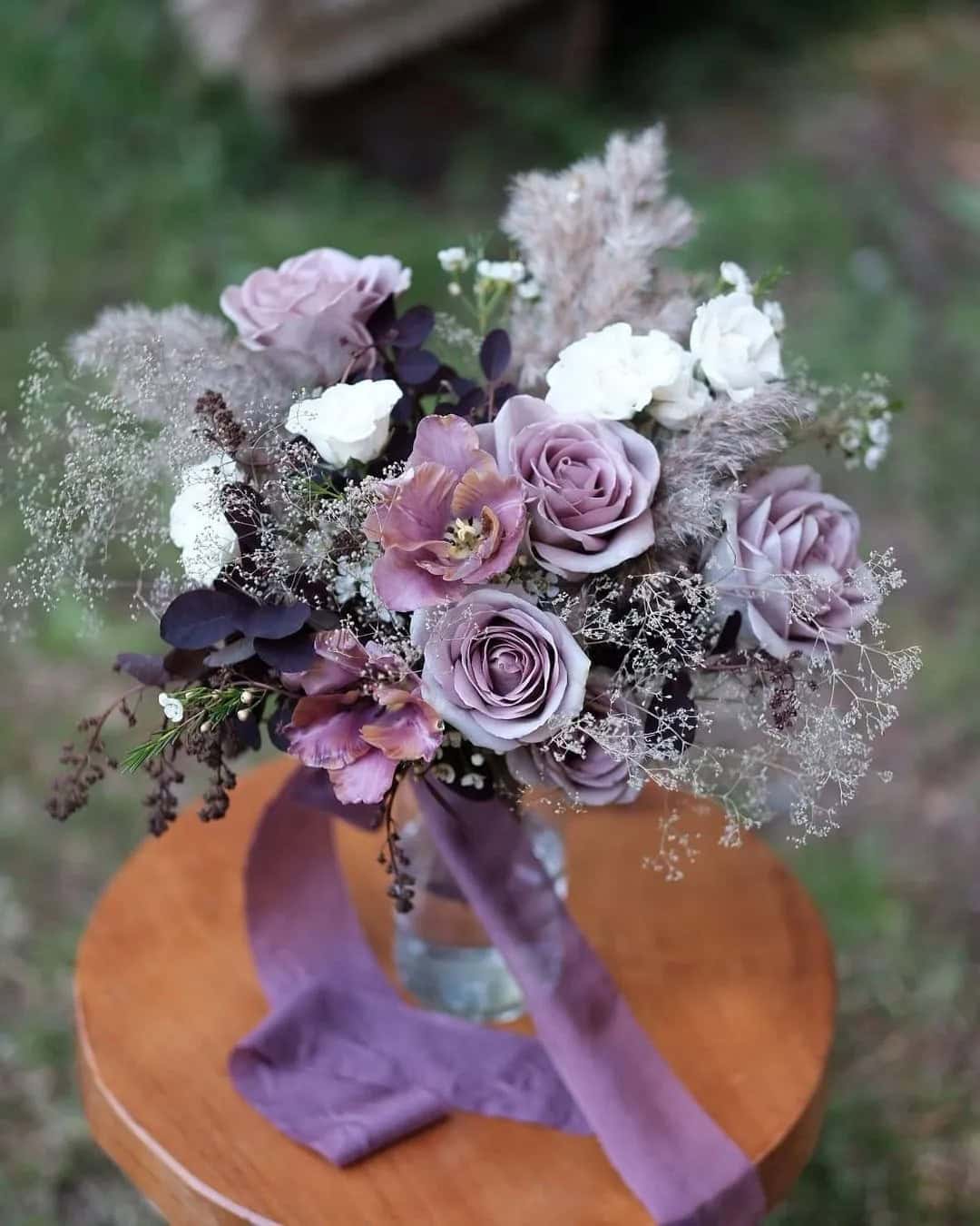
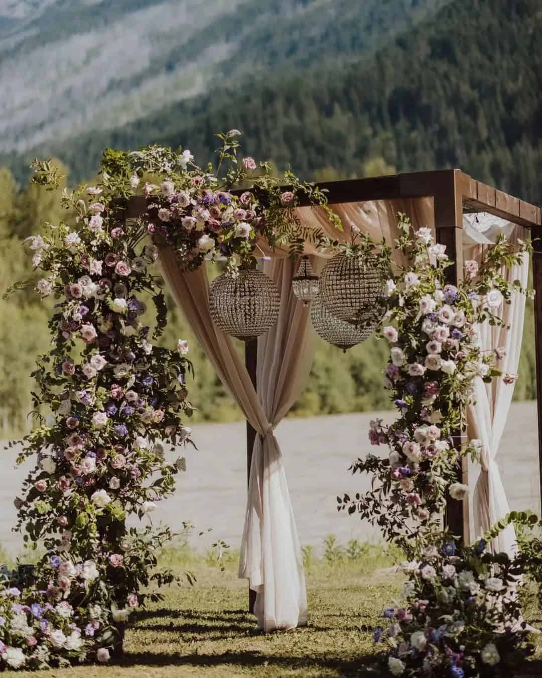
Incorporating Ultra Violet into your industrial chic wedding design is a great way to create a peaceful and mystical atmosphere. This purple-toned Pantone color is perfect for setting the tone for a romantic and whimsical celebration. When paired with oak brown, it adds a warm and cozy touch that’s sure to delight your guests. You can also use Ultra Violet as a backdrop and pair it with neutrals or mustard for added visual interest.
To really drive home the ambiance, consider incorporating these colors into your centerpieces, aisle decor, chair decor, and lighting design. This will create a cohesive look that’s sure to impress.
2017 – Greenery
Greenery, a timeless Pantone color of choice, embodies the essence of nature – think freshness, growth, strength, and vitality. Its adaptability makes it a perfect fit for every season, effortlessly standing alone or paired with other hues as accents.
This versatile shade thrives in neutral, bright, pastel, metallic, and even deep tones, radiating its unique charm.
It’s an ideal addition to bohemian, rustic, farm, woodland, and country weddings, where it can seamlessly blend with the surrounding environment.
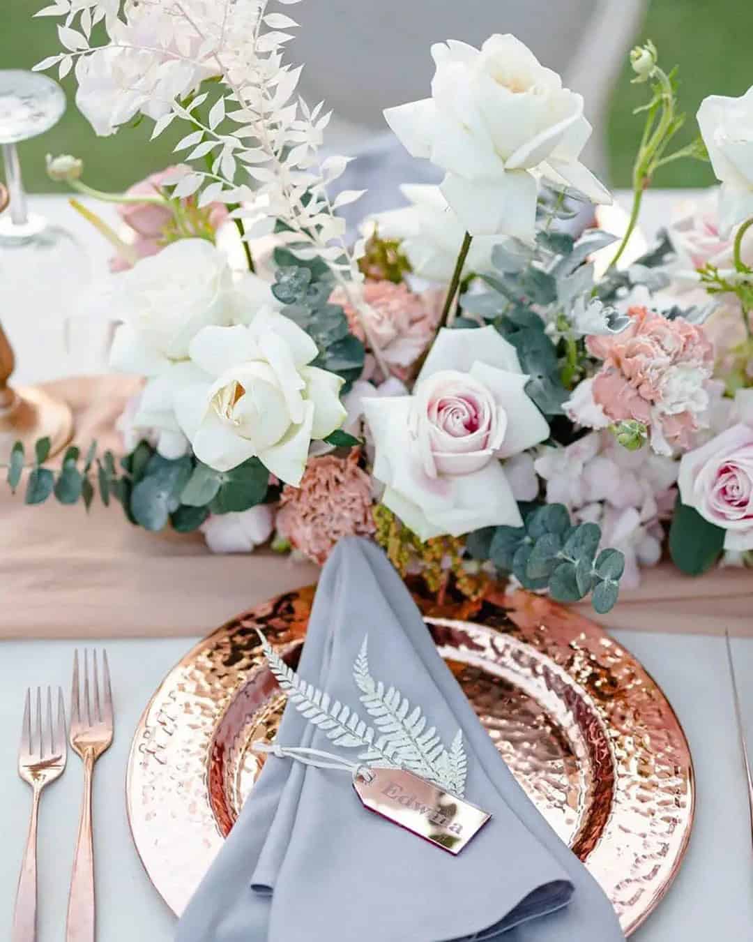
2016 – Rose Quartz and Serenity
Pantone’s Rose Quartz and Serenity evoke a sense of mindfulness, tranquility, and relaxation. These soothing hues would perfectly capture the essence of a romantic and comfortable wedding ambiance. When paired with metallic accents like silver, earthy tones such as sage green, neutral shades, and subtle gray notes, these colors can beautifully complement traditional, garden, or minimalist beach wedding themes.
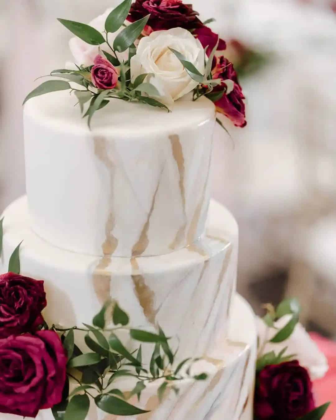
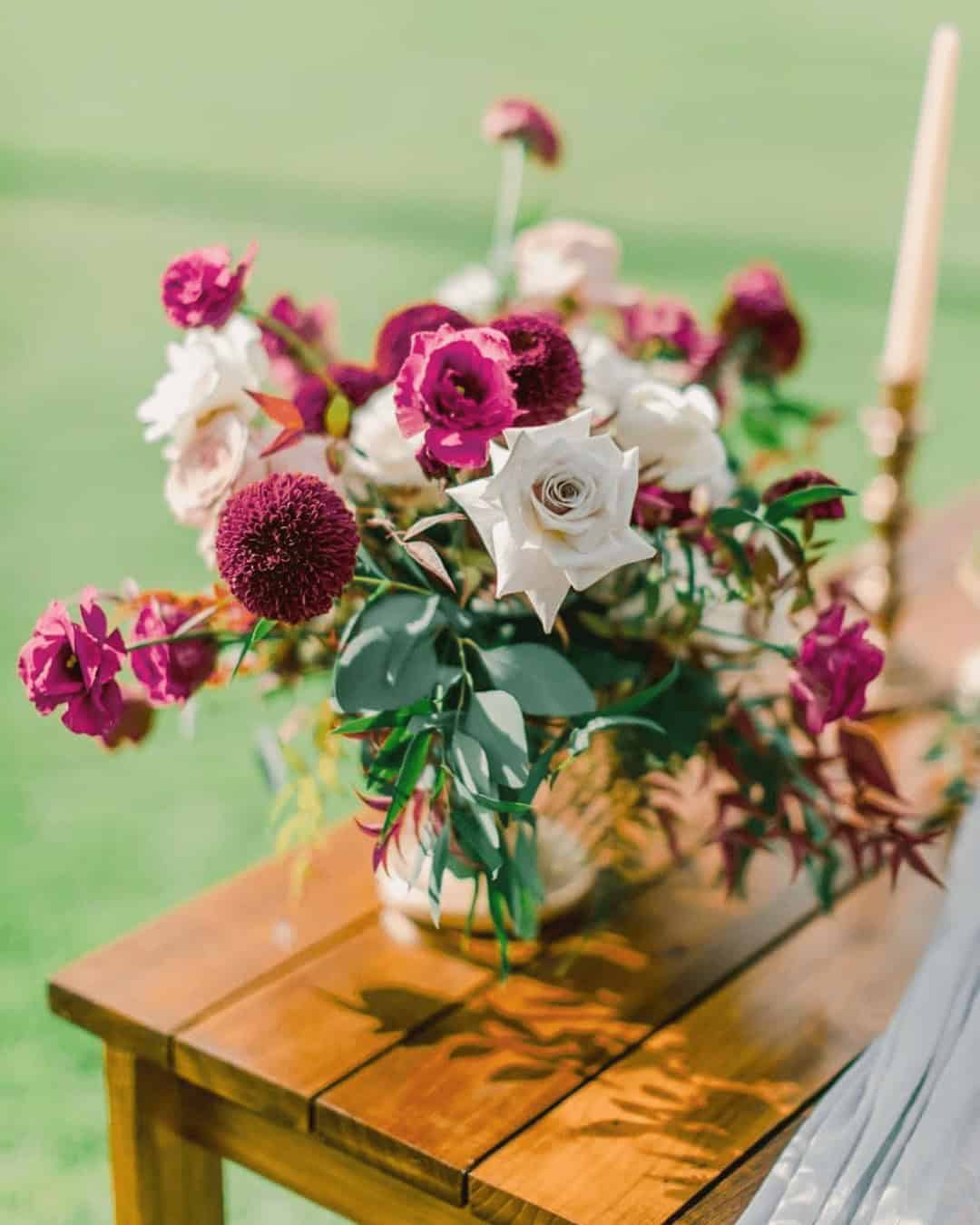
2015 – Marsala
Earthly elegance is the hallmark of Marsala, a rich and stable color that effortlessly evokes the warm tones of red wine and rustic brown hues. Its cool undertones make it an excellent choice for pairing with metallic gold, green, ivory, and brown, resulting in a sleek and organic aesthetic. For those who dare to be bold, Marsala can also be combined with light blue and blush for a truly unique look.
This versatile color is perfect for weddings that exude desert charm, vintage sophistication, or formal elegance.
2014 – Radiant Orchid
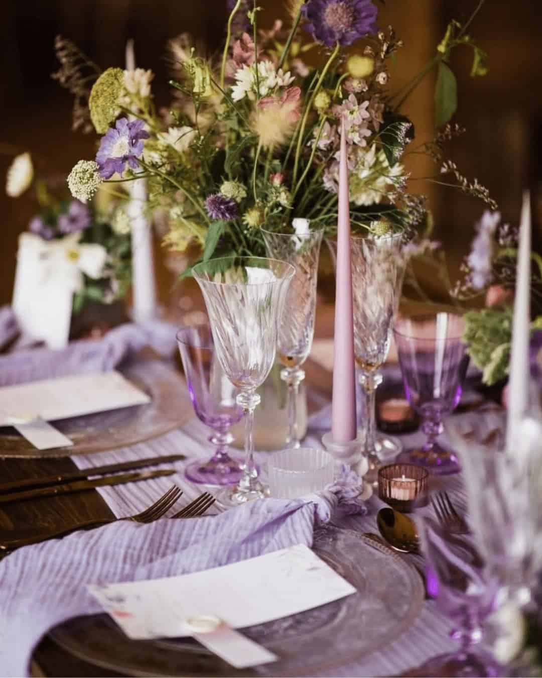
The enchanting Radiant Orchid color offers a portal to imaginative exploration, embodying authenticity, creativity, and playfulness. When paired with complementary hues like red, pink, gray, turquoise, or peach, the result is an unforgettable venue decor. Envision dramatic red chandeliers set against warm peach tablecloths, elegant gray flatware arrangements, and vibrant napkins that pop against a backdrop of soft pastels.
This captivating Pantone color effortlessly bridges modern and vintage aesthetics, making it a timeless choice for weddings that exude effortless sophistication.
2013 – Emerald

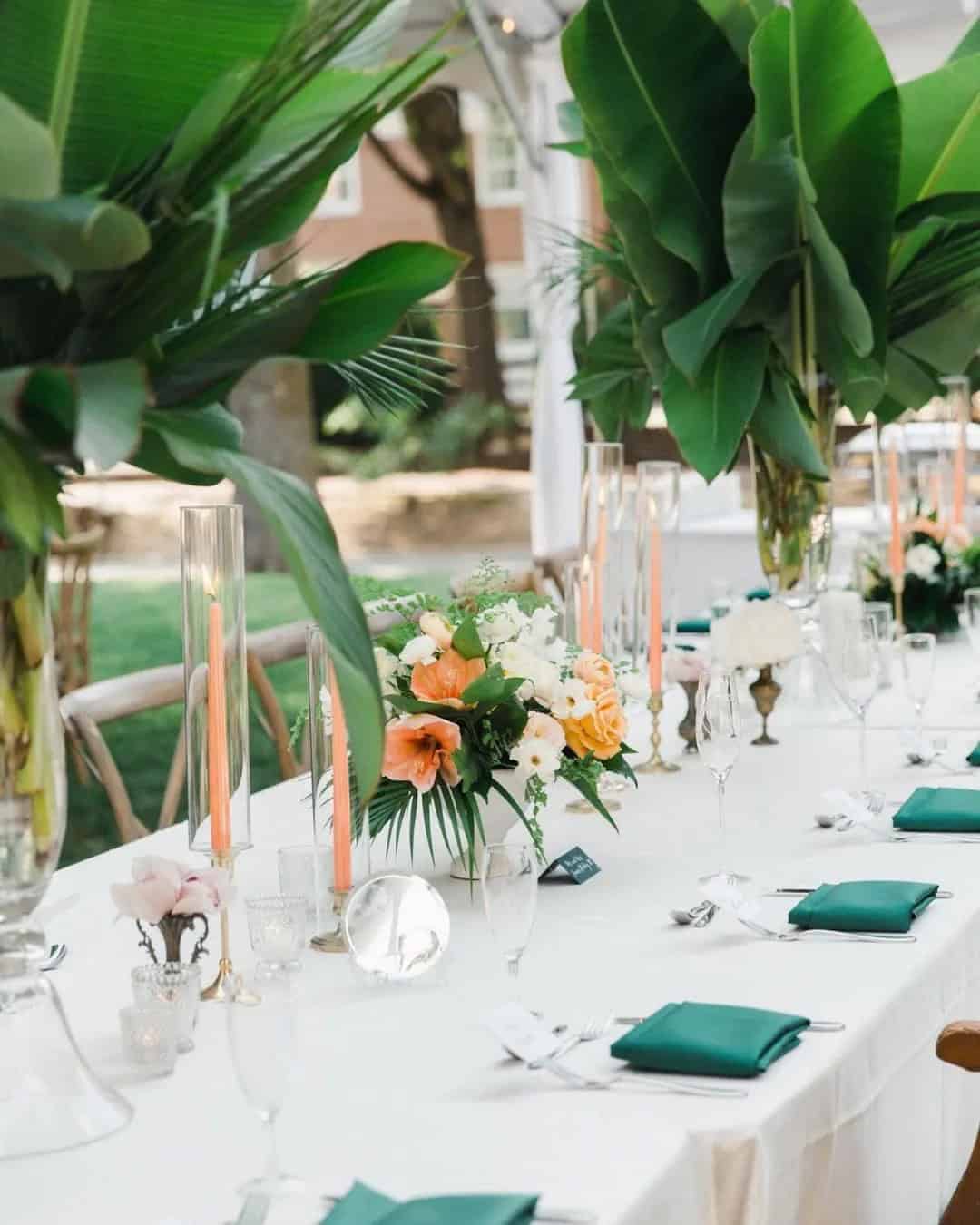
Imagine a luxurious and bold wedding aesthetic with the vibrant emerald hue as the centerpiece. This radiant color combination of bright green and yellow embodies opulence and radiance, making it the perfect choice for a grand ball-themed or vintage-inspired celebration. To incorporate this stunning shade into your wedding design, create a palette that incorporates gold, beige, blue, yellow, green, and black.
Let the emerald green be the star of the show by incorporating it into every aspect of your wedding, from attire to lighting, napkins to the chandelier, and even centerpieces to floral walls and backdrops. For an organic ambiance, use greenery in your floral decor to create a natural and effortless feel. Remember, when working with this bold color, less is often more – let the emerald green take center stage and let its radiance shine through.
2012 – Tangerine Tango
Tangerine Tango, the Pantone Color of the Year, brings an air of excitement and drama to any wedding celebration. Its vibrant blend of orange andante evokes feelings of fun, seduction, and energy – perfect for a sweltering summer day. To create a cohesive color palette for indoor weddings at restaurants, halls, barns, chapels, or estates, pair Tangerine Tango with complementary hues like turquoise, white, green, and orange.
The result is a visually stunning and playful atmosphere that’s sure to leave a lasting impression on your guests.
2011 – Honeysuckle
A vibrant shade reminiscent of a sunny red, Honeysuckle Pantone’s wedding color exudes energy and vitality. Its warm yet delicate tone makes it an ideal choice for princess-inspired and romantic weddings. We envision this hue playing nicely into the Wonderland theme concept, particularly when paired with white, light brown, and pink hues.
2010 – Turquoise

As you prepare to tie the knot on a picturesque beach, surrounded by the warmth of tropical paradise or the charm of a nautical setting, consider infusing your special day with the calming essence of Turquoise. This captivating hue embodies serenity, romance, and sweeping emotions, making it an ideal choice for creating an unforgettable ambiance. When paired with complementary colors such as white, brown, yellow, and green, Turquoise adds depth and allure to your wedding palette.
Its natural affinity with the outdoors makes it a perfect fit for beach or tropical destination weddings.
2009 – Mimosa

As you gaze upon the radiant Mimosa color, transported to a warm summer day where the scent of fresh citrus fills the air. This inviting shade embodies optimism, hope, and innovation, making it an ideal hue for summer and fall weddings. Whether incorporated into your backyard, beach, or indoor decor, Mimosa’s cheery tone is sure to bring joy and vitality to any celebration.
Its versatility allows it to harmonize effortlessly with a range of complementary colors, including light brown, sunset yellow, blue, sea green, and bright red, creating a vibrant atmosphere that’s hard to resist.
2008 – Blue Iris

Blue Iris, a captivating Pantone color, boasts an enchanting blend of soothing blue and rich purple hues that evoke a sense of serenity. This harmonious combination conveys strength, stability, and depth, making it an ideal choice for setting a peaceful ambiance at your special day. To add a touch of whimsy, consider pairing Blue Iris with creamy whites, gentle grays, or soft purples to create a visually striking wedding palette.
This palette is particularly well-suited for desert, enchanted, cultural, and woodland weddings, offering a unique opportunity to bring the outdoors in.
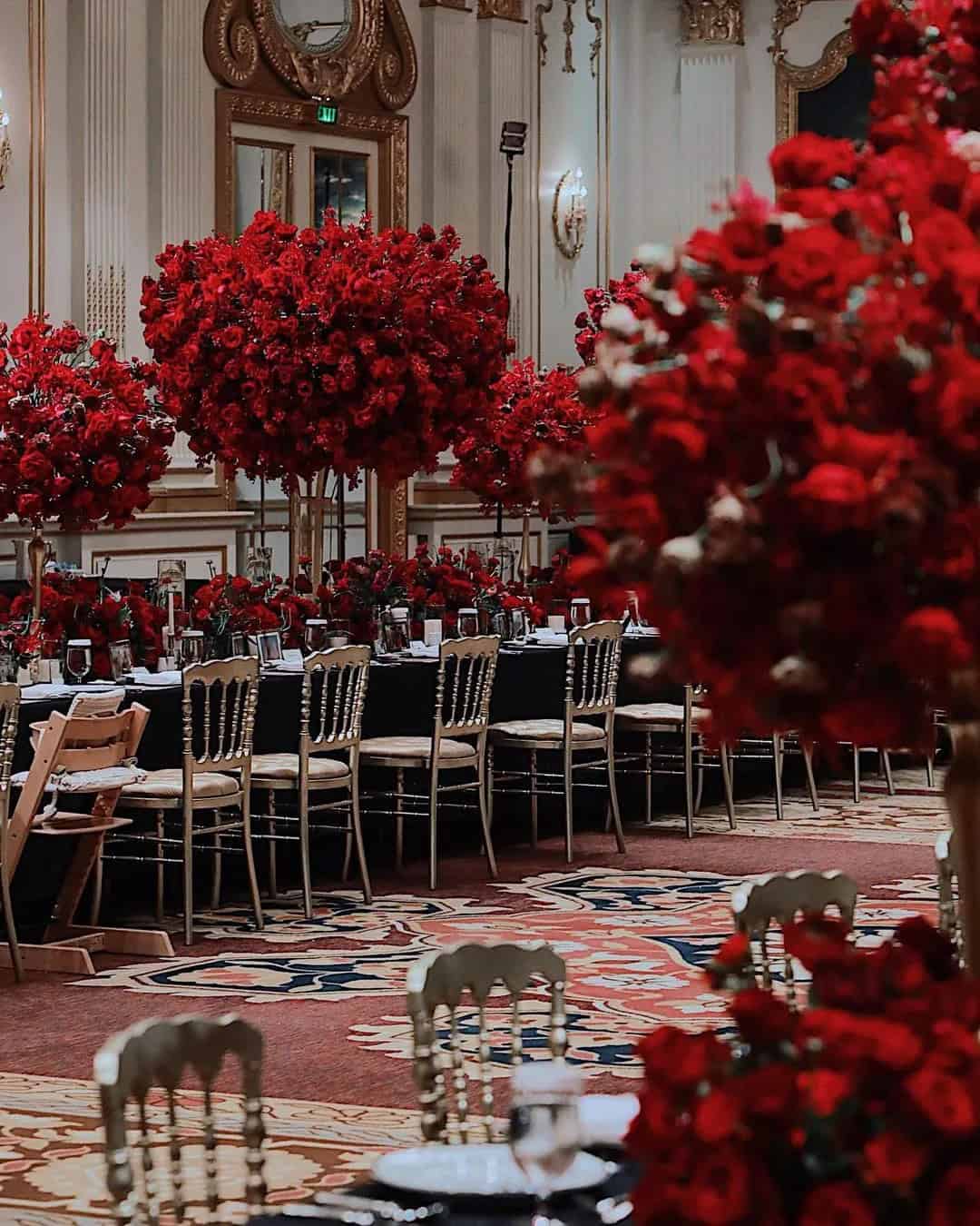
2007 – Chili Pepper


Imagine a warm, fiery tone that commands attention without being overwhelming – Chili Pepper is just that. This sophisticated shade of deep red embodies confidence and energy, making it perfect for glamorous and stylish weddings. When paired with neutral hues like cream, white, green, or brown, Chili Pepper adds a pop of personality to any celebration.
This palette is ideal for minimalist, bohemian, romantic, or rustic-themed weddings, where a bold yet understated color scheme can add depth and visual interest.
2006 – Sand Dollar

In a world of neutrals, one shade stands out from the crowd: Sand Dollar. This organic hue deftly balances beige and cream undertones, radiating warmth, health, and comfort. It’s an ideal choice for desert, forest, or Arabian-inspired weddings. For a cohesive look, pair it with crisp white accents to maintain a neutral vibe.
However, if you want to add some excitement and drama to your wedding palette, consider incorporating rustic brown, terracotta, and gray tones to create a unique and captivating color scheme.
2005 – Blue Turquoise

Imagine a color that embodies the serene beauty of a clear aqua sky, yet also whispers tales of the wild ocean waves. Blue Turquoise is more than just another shade – it’s an expression of temperament, calming and invigorating at the same time. For your beach, nautical, coastal, or lakeside wedding, this stunning hue is a must-have. Its versatility allows it to be paired with bold colors like red, black, brown, silver, or green, effortlessly elevating the overall aesthetic.
Whether you’re looking for a soothing and peaceful atmosphere or a vibrant and energetic vibe, Blue Turquoise is sure to captivate and inspire.
2004 – Tiger lily
Tiger Lily, a vibrant reddish-orange hue from the Pantone wedding color palettes, is sure to bring a pop of excitement to your special day. This exotic shade is perfect for modern or glam weddings, where you can incorporate it into various elements such as floral decor, hair accessories, attire, place cards, napkins, and even lighting. For those who want to keep things subtle, pairing Tiger Lily with neutral shades like cream and ivory creates a beautiful contrast.
Alternatively, complementary colors like peach and burnt orange add an extra layer of sophistication.
2003 – Aqua Sky

Imagine setting the tone for your sunset wedding with the serene hue of an aqua sky. This calming color, reminiscent of a cloudless day’s blue-green tones, embodies tranquility and hope. To bring this peaceful atmosphere to life, pair it with earthy shades like gray, cream, and brown, perfect for country, park, or rustic weddings.
2002 – True Red

The Pantone colors of the year offer a unique glimpse into the prevailing emotions and trends of our era. Among these iconic hues is True Red, a vibrant shade that evokes feelings of power, love, and romance. To incorporate this bold color into your special day, consider pairing it with neutral tones like cream, brown, and silver for an outdoor wedding celebration. Alternatively, you could use True Red as a statement piece in your attire or accessories for a more relaxed, casual affair.
2001 – Fuchsia Rose

Fuchsia Rose, with its deep pink to bright red hue, embodies sensuality and femininity. This captivating shade presents a solution for those torn between the allure of pink and the boldness of red. It’s an ideal choice for indoor, garden, or enchanted-themed weddings. The color combination possibilities are endless, with Fuchsia Rose pairing beautifully with sea green, moss, black, cream, and brown to create unique and memorable wedding aesthetics.
2000 – Cerulean